1 Basic 基础按钮 type:设置按钮颜色 1 2 3 4 5 6 <el-button>Default</el-button> <el-button type="primary">Primary</el-button> <el-button type="success">Success</el-button> <el-button type="info">Info</el-button> <el-button type="warning">Warning</el-button> <el-button type="danger">Danger</el-button>
属性:
①plain:半透明 1 2 3 4 5 6 <el-button plain>Plain</el-button> <el-button type="primary" plain>Primary</el-button> <el-button type="success" plain>Success</el-button> <el-button type="info" plain>Info</el-button> <el-button type="warning" plain>Warning</el-button> <el-button type="danger" plain>Danger</el-button>
②round:圆角 1 2 3 4 5 6 <el-button round>Round</el-button> <el-button type="primary" round>Primary</el-button> <el-button type="success" round>Success</el-button> <el-button type="info" round>Info</el-button> <el-button type="warning" round>Warning</el-button> <el-button type="danger" round>Danger</el-button>
③:icon: 添加图标,要导入图标 1 2 3 4 5 6 7 8 9 10 11 12 13 14 15 16 17 <el-button :icon="Search" circle /> <el-button type="primary" :icon="Edit" circle /> <el-button type="success" :icon="Check" circle /> <el-button type="info" :icon="Message" circle /> <el-button type="warning" :icon="Star" circle /> <el-button type="danger" :icon="Delete" circle /> <script lang="ts" setup> import { Check, Delete, Edit, Message, Search, Star, } from '@element-plus/icons-vue' </script>
④disabled:禁用 1 <el-button disabled>Default</el-button>
⑤link:链接按钮 ⭐通过绑定事件实现跳转
1 2 3 4 <el-button type="link" @click="handleClick">跳转到示例页面</el-button> //设置disabled后会被禁用 <el-button type="link" disabled>链接已禁用</el-button>
⑥text:文字按钮,提供一种只显示文字而没有按钮边框或背景 的按钮样式,用在需要轻量级操作或与文字链接类似的场景。(版本3.0.0被移除) 1 2 3 4 5 //Basic <el-button text></el-button> //Background color always on <el-button text bg></el-button>
⑦图标按钮(需导入图标) 1 2 3 4 5 6 7 8 9 10 11 12 13 14 <template> <div> <el-button type="primary" :icon="Edit" /> <el-button type="primary" :icon="Share" /> <el-button type="primary" :icon="Delete" /> <el-button type="primary" :icon="Search">Search</el-button> <el-button type="primary"> Upload<el-icon class="el-icon--right"><Upload /></el-icon> </el-button> </div> </template> <script setup lang="ts"> import { Delete, Edit, Search, Share, Upload } from '@element-plus/icons-vue' </script>
⑧按钮组:用于将多个按钮组合在一起,例如工具栏、多选操作等。 使用 <el-button-group> 对多个按钮分组。 使用方法:只需将多个 <el-button> 放在 <el-button-group> 中即可。
1 2 3 4 5 6 7 8 9 10 11 <template> <el-button-group> <el-button>上一页</el-button> <el-button>下一页</el-button> </el-button-group> </template> <el-button-group> <el-button icon="el-icon-edit">编辑</el-button> <el-button icon="el-icon-delete">删除</el-button> <el-button icon="el-icon-share">分享</el-button> </el-button-group>
⑨加载状态按钮:在点击后显示加载动画的按钮,常用于异步操作场景,比如提交表单、数据加载等。 通过设置 loading 属性为 true 来显示加载中状态。
可以使用 loading 插槽或 loadingIcon属性自定义您的loading图标
ps: loading 插槽优先级高于loadingIcon属性
1 2 3 4 5 6 7 8 9 10 <el-button type="primary" loading>Loading</el-button> <el-button type="primary" :loading-icon="Eleme" loading>Loading</el-button> <el-button type="primary" loading> <template #loading> <div class="custom-loading"> ... </div> </template> Loading </el-button>
⑩调整尺寸 按钮组件还提供了几种额外的尺寸可供选择:large,small,还有默认大小
1 2 3 <el-button size="large">Large</el-button> <el-button>Default</el-button> <el-button size="small">Small</el-button>
eg:
1 2 3 4 5 6 <template> <el-container tag="section"> <el-header>头部内容</el-header> <el-main>主要内容</el-main> </el-container> </template>
渲染结果: 1 2 3 4 <section class ="el-container" > <header class ="el-header" > 头部内容</header > <main class ="el-main" > 主要内容</main > </section >
⑫自定义按钮颜色 color 其他属性详见官网
1.2 Border 边框 边框样式 css样式设置:border:1px solid/dashed
圆角 1 2 3 4 5 6 7 8 9 10 11 12 13 14 15 16 17 18 19 20 21 22 23 24 25 26 27 28 29 30 31 32 33 34 35 36 37 38 39 40 <template> <el-row :gutter="12" class="demo-radius"> //span="6" 表示每个 el-col 占 6 分的宽度,适用于桌面端。xs="{ span: 12 }" 为小屏设备(如手机)设置了每列占 12 分。 <el-col :span="6" :xs="{ span: 12 }"> <div class="title">No Radius</div> <div class="value"> <code> border-radius:0px </code> </div> <div class="radius" :style="{borderRadius: No Radius}" /> </el-col> </el-row> </template> <style scoped> //设置了圆角名称的样式,使用了 Element Plus 的颜色变量。 .demo-radius .title { color: var(--el-text-color-regular); font-size: 18px; margin: 10px 0; } //显示圆角样式的代码,使用了元素的主要文本颜色 .demo-radius .value { color: var(--el-text-color-primary); font-size: 16px; margin: 10px 0; } //定义了一个盒子,默认高度为 40px,宽度为 70%,并设置了边框和初始 border-radius: 0,该属性会根据不同的圆角类型动态更新。 .demo-radius .radius { height: 40px; width: 70%; border: 1px solid var(--el-border-color); border-radius: 0; margin-top: 20px; } </style>
阴影 1 2 3 4 5 6 7 8 9 10 11 12 13 14 15 16 <div class="inline-flex" h="30" w="30" m="2" :style="{ boxShadow: “--el-box-shadow”, }" /> <span p="y-4" class="demo-shadow-text" text="sm"> {{ shadow.name }} </span> <code text="xs"> {{ getCssVarName(shadow.type) }} </code> </div>
1.3 Color色彩 Element Plus 为了避免视觉传达差异,使用一套特定的调色板来规定颜色,为你所搭建的产品提供一致的外观视觉感受。
详细见官方文档:Color 色彩 | Element Plus
1.4 Container布局容器 用于布局的容器组件,方便快速搭建页面的基本结构:
<el-container>:外层容器。 当子元素中包含 <el-header> 或 <el-footer> 时,全部子元素会垂直上下排列, 否则会水平左右排列。
<el-header>:顶栏容器。
<el-aside>:侧边栏容器。
<el-main>:主要区域容器。
<el-footer>:底栏容器。
⭐以上组件采用了 flex 布局,使用前请确定目标浏览器是否兼容。 此外, <el-container>的直接子元素必须是后四个组件中的一个或多个。 后四个组件的父元素必须是一个 <el-container>
1.5 Icon图标 安装 1 2 3 4 5 //npm npm install @element-plus/icons-vue //yarn yarn add @element-plus/icons-vue
注册所有图标(不建议) 1 2 3 4 5 6 7 8 9 import * as ElementPlus 学习IconsVue from '@element-plus/icons-vue' const app = createApp (App )for (const [key, component] of Object .entries (ElementPlus 学习IconsVue )) { app.component (key, component) }
自动导入(建议) 使用 unplugin-icons 和 unplugin-auto-import 从 iconify 中自动导入任何图标集。
在vite.config.js/vite.config.ts的defineConfig中添加:
1 2 3 4 5 6 7 8 9 10 11 12 13 14 15 16 17 18 19 20 21 22 23 24 25 26 27 28 29 30 31 32 33 34 35 36 37 38 39 40 41 42 43 44 45 46 47 48 49 50 51 52 53 54 55 56 57 58 59 60 61 import path from 'path' import { defineConfig } from 'vite' import Vue from '@vitejs/plugin-vue' import Icons from 'unplugin-icons/vite' import IconsResolver from 'unplugin-icons/resolver' import AutoImport from 'unplugin-auto-import/vite' import Components from 'unplugin-vue-components/vite' import { ElementPlus 学习Resolver } from 'unplugin-vue-components/resolvers' import Inspect from 'vite-plugin-inspect' const pathSrc = path.resolve (__dirname, 'src' )export default defineConfig ({ resolve : { alias : { '@' : pathSrc, }, }, plugins : [ Vue (), AutoImport ({ imports : ['vue' ], resolvers : [ ElementPlus 学习Resolver (), IconsResolver ({ prefix : 'Icon' , }), ], dts : path.resolve (pathSrc, 'auto-imports.d.ts' ), }), Components ({ resolvers : [ IconsResolver ({ enabledCollections : ['ep' ], }), ElementPlus 学习Resolver (), ], dts : path.resolve (pathSrc, 'components.d.ts' ), }), Icons ({ autoInstall : true , }), Inspect (), ], })
基础用法 1 2 3 4 5 <el-icon :size="size" :color="color"> <Edit /> </el-icon> <!-- 或者独立使用它,不从父级获取属性 --> <Edit />
1.6 Layout布局 通过基础的 24 分栏,迅速简便地创建布局。
⭐组件默认使用 Flex 布局,不需要手动设置 type="flex"。请注意父容器避免使用 inline 相关样式,会导致组件宽度不能撑满。
基础布局 通过 row 和 col 组件,并通过 col 组件的 span 属性我们就可以自由地组合布局。
1 2 3 4 5 6 7 8 9 <template> <el-row> <el-col :span="24"><div class="grid-content ep-bg-purple-dark" /></el-col> </el-row> <el-row> <el-col :span="12"><div class="grid-content ep-bg-purple" /></el-col> <el-col :span="12"><div class="grid-content ep-bg-purple-light" /></el-col> </el-row> </template>
分栏间隔 支持列间距
行提供 gutter 属性来指定列之间的间距,其默认值为0。
1 2 3 4 5 6 7 8 <template> <el-row :gutter="20"> <el-col :span="6"><div class="grid-content ep-bg-purple" /></el-col> <el-col :span="6"><div class="grid-content ep-bg-purple" /></el-col> <el-col :span="6"><div class="grid-content ep-bg-purple" /></el-col> <el-col :span="6"><div class="grid-content ep-bg-purple" /></el-col> </el-row> </template>
混合布局 通过基础的 1/24 分栏任意扩展组合形成较为复杂的混合布局。
1 2 3 4 5 6 7 8 9 10 11 12 13 14 15 16 17 <template> <el-row :gutter="20"> <el-col :span="16"><div class="grid-content ep-bg-purple" /></el-col> <el-col :span="8"><div class="grid-content ep-bg-purple" /></el-col> </el-row> <el-row :gutter="20"> <el-col :span="8"><div class="grid-content ep-bg-purple" /></el-col> <el-col :span="8"><div class="grid-content ep-bg-purple" /></el-col> <el-col :span="4"><div class="grid-content ep-bg-purple" /></el-col> <el-col :span="4"><div class="grid-content ep-bg-purple" /></el-col> </el-row> <el-row :gutter="20"> <el-col :span="4"><div class="grid-content ep-bg-purple" /></el-col> <el-col :span="16"><div class="grid-content ep-bg-purple" /></el-col> <el-col :span="4"><div class="grid-content ep-bg-purple" /></el-col> </el-row> </template>
列偏移 您可以指定列偏移量,即推迟或“偏移”该列,以便它不再紧接着前一个列,而是向右移动指定的宽度。
通过制定 col 组件的 offset 属性可以指定分栏偏移的栏数。
1 2 3 4 5 6 7 8 9 10 11 12 13 14 15 16 17 18 19 20 21 <template> <el-row :gutter="20"> <el-col :span="6"><div class="grid-content ep-bg-purple" /></el-col> <el-col :span="6" :offset="6"> <div class="grid-content ep-bg-purple" /> </el-col> </el-row> <el-row :gutter="20"> <el-col :span="6" :offset="6"> <div class="grid-content ep-bg-purple" /> </el-col> <el-col :span="6" :offset="6"> <div class="grid-content ep-bg-purple" /> </el-col> </el-row> <el-row :gutter="20"> <el-col :span="12" :offset="6"> <div class="grid-content ep-bg-purple" /> </el-col> </el-row> </template>
对齐方式 默认使用 flex 布局来对分栏进行灵活的对齐。
您可以通过justify 属性来定义子元素的排版方式,其取值为start、center、end、space-between、space-around或space-evenly。
1 2 3 4 5 6 7 8 9 10 11 12 13 14 //示范第一行和第二行 <template> //未设置对齐方式 <el-row class="row-bg"> <el-col :span="6"><div class="grid-content ep-bg-purple" /></el-col> <el-col :span="6"><div class="grid-content ep-bg-purple-light" /></el-col> <el-col :span="6"><div class="grid-content ep-bg-purple" /></el-col> </el-row> <el-row class="row-bg" justify="center"> <el-col :span="6"><div class="grid-content ep-bg-purple" /></el-col> <el-col :span="6"><div class="grid-content ep-bg-purple-light" /></el-col> <el-col :span="6"><div class="grid-content ep-bg-purple" /></el-col> </el-row> </template>
响应式布局 参照了 Bootstrap 的 响应式设计,预设了五个响应尺寸:xs、sm、md、lg 和 xl。
1 2 3 4 5 6 7 8 9 10 11 12 13 14 15 16 <template> <el-row :gutter="10"> <el-col :xs="8" :sm="6" :md="4" :lg="3" :xl="1"> <div class="grid-content ep-bg-purple" /> </el-col> <el-col :xs="4" :sm="6" :md="8" :lg="9" :xl="11"> <div class="grid-content ep-bg-purple-light" /> </el-col> <el-col :xs="4" :sm="6" :md="8" :lg="9" :xl="11"> <div class="grid-content ep-bg-purple" /> </el-col> <el-col :xs="8" :sm="6" :md="4" :lg="3" :xl="1"> <div class="grid-content ep-bg-purple-light" /> </el-col> </el-row> </template>
基于断点的隐藏类 Element Plus 额外提供了一系列类名,用于在某些条件下隐藏元素。 这些类名可以添加在任何 DOM 元素或自定义组件上。 如果需要,请自行引入以下文件:
1 import 'element-plus/theme-chalk/display.css'
这些类名为:
hidden-xs-only - 当视口在 xs 尺寸时隐藏hidden-sm-only - 当视口在 sm 尺寸时隐藏hidden-sm-and-down - 当视口在 sm 及以下尺寸时隐藏hidden-sm-and-up - 当视口在 sm 及以上尺寸时隐藏hidden-md-only - 当视口在 md 尺寸时隐藏hidden-md-and-down - 当视口在 md 及以下尺寸时隐藏hidden-md-and-up - 当视口在 md 及以上尺寸时隐藏hidden-lg-only - 当视口在 lg 尺寸时隐藏hidden-lg-and-down - 当视口在 lg 及以下尺寸时隐藏hidden-lg-and-up - 当视口在 lg 及以上尺寸时隐藏hidden-xl-only - 当视口在 xl 尺寸时隐藏
1.7 Link链接 文字超链接
基础用法 1 2 3 4 5 6 7 8 9 10 11 <template> //可加禁用 <div> <el-link href="https://element-plus.org" target="_blank">default</el-link> <el-link type="primary">primary</el-link> <el-link type="success">success</el-link> <el-link type="warning">warning</el-link> <el-link type="danger">danger</el-link> <el-link type="info">info</el-link> </div> </template>
下划线 :underline=””
1
2
3
4
5
6
<template> <div> <el-link :underline="false">Without Underline</el-link> <el-link>With Underline</el-link> </div> </template>
图标 :icon
1 2 3 4 5 6 7 8 <template> <div> <el-link :icon="Edit">Edit</el-link> <el-link> Check<el-icon><icon-view /></el-icon> </el-link> </div> </template>
1.8 Text 文本的常见操作
基础用法 由 type 属性来选择 Text 的类型。
1 2 3 4 5 6 7 8 <template> <el-text class="mx-1">Default</el-text> <el-text class="mx-1" type="primary">Primary</el-text> <el-text class="mx-1" type="success">Success</el-text> <el-text class="mx-1" type="info">Info</el-text> <el-text class="mx-1" type="warning">Warning</el-text> <el-text class="mx-1" type="danger">Danger</el-text> </template>
尺寸 使用 size 属性配置尺寸,可选的尺寸大小有: large, default 或 small
1 2 3 4 5 <template> <el-text class="mx-1" size="large">Large</el-text> <el-text class="mx-1">Default</el-text> <el-text class="mx-1" size="small">Small</el-text> </template>
省略 通过 truncated 属性,在文本超过视图或最大宽度设置时展示省略符。 通过 line-clamp 属性控制多行的样式
1 2 3 4 5 6 7 8 9 10 11 12 13 14 <template> <el-text class="w-150px mb-2" truncated> Self element set width 100px </el-text> <el-row class="w-150px mb-2"> <el-text truncated>Squeezed by parent element</el-text> </el-row> //line-clamp:显示几行 <el-text line-clamp="2"> The -webkit-line-clamp CSS property<br /> allows limiting of the contents of<br /> a block to the specified number of lines. </el-text> </template>
覆盖 使用属性 tag 覆盖元素
1 2 3 4 5 6 7 8 9 10 11 12 13 14 15 16 17 18 19 <template> <el-space direction="vertical"> <el-text>span</el-text> <el-text tag="p">This is a paragraph.</el-text> <el-text tag="b">Bold</el-text> <el-text tag="i">Italic</el-text> <el-text> This is <el-text tag="sub" size="small">subscript</el-text> </el-text> <el-text> This is <el-text tag="sup" size="small">superscript</el-text> </el-text> <el-text tag="ins">Inserted</el-text> <el-text tag="del">Deleted</el-text> <el-text tag="mark">Marked</el-text> </el-space> </template>
混合使用 混合使用 Text 组件
1 2 3 4 5 6 7 8 9 10 11 12 13 14 15 16 17 18 19 20 21 22 23 24 25 26 <template> <el-space direction="vertical"> <el-text> <el-icon> <ElementPlus学习 /> </el-icon> Element-Plus </el-text> <el-row> <el-text>Rate</el-text> <el-rate class="ml-1" /> </el-row> <el-text> This is text mixed icon <el-icon> <Bell /> </el-icon> and component <el-button>Button</el-button> </el-text> </el-space> </template> <script lang="ts" setup> import { Bell, ElementPlus学习 } from '@element-plus/icons-vue' </script>
用于替换浏览器原生滚动条。
基础用法 通过 height 属性设置滚动条高度,若不设置则根据父容器高度自适应。
1 2 3 4 5 <template> <el-scrollbar height="400px"> <p v-for="item in 20" :key="item" class="scrollbar-demo-item">{{ item }}</p> </el-scrollbar> </template>
横向滚动 当元素宽度大于滚动条宽度时,会显示横向滚动条。
1 2 3 4 5 6 7 8 9 10 11 12 13 14 15 16 17 18 19 20 21 22 23 24 25 26 27 28 <template> <el-scrollbar> <div class="scrollbar-flex-content"> <p v-for="item in 50" :key="item" class="scrollbar-demo-item"> {{ item }} </p> </div> </el-scrollbar> </template> <style scoped> .scrollbar-flex-content { display: flex; } .scrollbar-demo-item { flex-shrink: 0; display: flex; align-items: center; justify-content: center; width: 100px; height: 50px; margin: 10px; text-align: center; border-radius: 4px; background: var(--el-color-danger-light-9); color: var(--el-color-danger); } </style>
最大高度 当元素高度超过最大高度,才会显示滚动条。
设置max-height=””
1 2 3 4 5 6 7 8 9 10 11 12 13 14 15 16 17 18 19 20 21 22 23 <template> <el-button @click="add">Add Item</el-button> <el-button @click="onDelete">Delete Item</el-button> <el-scrollbar max-height="400px"> <p v-for="item in count" :key="item" class="scrollbar-demo-item"> {{ item }} </p> </el-scrollbar> </template> <script lang="ts" setup> import { ref } from 'vue' const count = ref(3) const add = () => { count.value++ } const onDelete = () => { if (count.value > 0) { count.value-- } } </script>
手术滚动 通过使用 setScrollTop 与 setScrollLeft 方法,可以手动控制滚动条滚动。
1
2
3
4
5
6
7
8
9
10
11
12
13
14
15
16
17
18
19
20
21
22
23
24
25
26
27
28
29
30
31
32
33
34
35
36
37
38
39
40
<template> <el-scrollbar ref="scrollbarRef" height="400px" always @scroll="scroll"> <div ref="innerRef"> <p v-for="item in 20" :key="item" class="scrollbar-demo-item"> {{ item }} </p> </div> </el-scrollbar> <el-slider v-model="value" :max="max" :format-tooltip="formatTooltip" @input="inputSlider" /> </template> <script lang="ts" setup> import { onMounted, ref } from 'vue' import { ElScrollbar } from 'element-plus' const max = ref(0) const value = ref(0) const innerRef = ref<HTMLDivElement>() const scrollbarRef = ref<InstanceType<typeof ElScrollbar>>() onMounted(() => { max.value = innerRef.value!.clientHeight - 380 }) const inputSlider = (value: number) => { scrollbarRef.value!.setScrollTop(value) } const scroll = ({ scrollTop }) => { value.value = scrollTop } const formatTooltip = (value: number) => { return `${value} px` } </script>
1.10 Space间距 虽然我们拥有 Divider 组件 (分割线组件),但很多时候我们需要不是一个被 Divider 组件 分割开的页面结构,因此我们会重复的使用很多的 Divider 组件 ,这在我们的开发效率上造成了一定的困扰。 间距组件 就是为了解决这种困扰应运而生的。
基础用法 最基础的用法,通过这个组件来给组件之间提供统一的间距。
通过间距组件来给多个组件之间提供间距
1 2 3 4 5 6 7 8 9 10 11 12 13 14 15 16 <template> //wrap 设置是否自动折行 默认:false <el-space wrap> <el-card v-for="i in 3" :key="i" class="box-card" style="width: 250px"> <template #header> <div class="card-header"> <span>Card name</span> <el-button class="button" text>Operation button</el-button> </div> </template> <div v-for="o in 4" :key="o" class="text item"> {{ 'List item ' + o }} </div> </el-card> </el-space> </template>
垂直布局 使用 direction 来控制布局的方式, 背后实际上是利用了 flex-direction 来控制.
我们也提供垂直布局方式。
1 2 3 4 5 6 7 8 9 10 11 12 13 14 15 <template> <el-space direction="vertical"> <el-card v-for="i in 2" :key="i" class="box-card" style="width: 250px"> <template #header> <div class="card-header"> <span>Card name</span> <el-button class="button" text>Operation button</el-button> </div> </template> <div v-for="o in 4" :key="o" class="text item"> {{ 'List item ' + o }} </div> </el-card> </el-space> </template>
控制间距的大小 通过调整 size 的值来控制间距的大小
使用内置的 small、default、large 来设置间距大小,分别对应 8px、12px 和 16px 的间距。 默认的间距大小为 small,也就是 8px。
您也可以通过自定义的 size 来控制大小, 参见下一个部分。
1 2 3 4 5 6 7 8 9 10 11 12 13 <el-space wrap :size="size"> <el-card v-for="i in 3" :key="i" class="box-card" style="width: 250px"> <template #header> <div class="card-header"> <span>Card name</span> <el-button class="button" text>Operation button</el-button> </div> </template> <div v-for="o in 4" :key="o" class="text item"> {{ 'List item ' + o }} </div> </el-card> </el-space>
自定义Size 很多时候,内建的大小不满足设计师的要求,我们可以通过传入自己定义的大小 (数值类型) 来设置。
1 2 3 4 5 6 7 8 9 10 11 12 13 14 15 16 17 18 19 20 21 22 <template> <el-slider v-model="size" /> <el-space wrap :size="size"> <el-card v-for="i in 2" :key="i" class="box-card" style="width: 250px"> <template #header> <div class="card-header"> <span>Card name</span> <el-button class="button" text>Operation button</el-button> </div> </template> <div v-for="o in 4" :key="o" class="text item"> {{ 'List item ' + o }} </div> </el-card> </el-space> </template> <script lang="ts" setup> import { ref } from 'vue' const size = ref(20) </script>
自动换行 在 水平 (horizontal) ** 模式下,通过使用 wrap( 布尔类型**)来控制自动换行行为。
利用 wrap 属性控制换行,默认false
1 2 3 4 5 6 7 <template> <el-space wrap> <div v-for="i in 20" :key="i"> <el-button text> Text button </el-button> </div> </el-space> </template>
行间分隔符 有时候,仅仅在行间加空白并不能满足我们的日常需求,此时分隔符 (spacer) 就可以发挥非常好的作用了。
字母数字类型分隔符 1 2 3 4 5 6 7 8 9 10 11 12 13 <template> <el-space :size="size" spacer="|"> <div v-for="i in 2" :key="i"> <el-button> button {{ i }} </el-button> </div> </el-space> </template> <script lang="ts" setup> import { ref } from 'vue' const size = ref(10) </script>
分隔符还可以是 VNode 类型 1 2 3 4 5 6 7 8 9 10 11 12 13 14 15 <template> <el-space :size="size" :spacer="spacer"> <div v-for="i in 2" :key="i"> <el-button> button {{ i }} </el-button> </div> </el-space> </template> <script lang="ts" setup> import { h, ref } from 'vue' import { ElDivider } from 'element-plus' const size = ref(10) const spacer = h(ElDivider, { direction: 'vertical' }) </script>
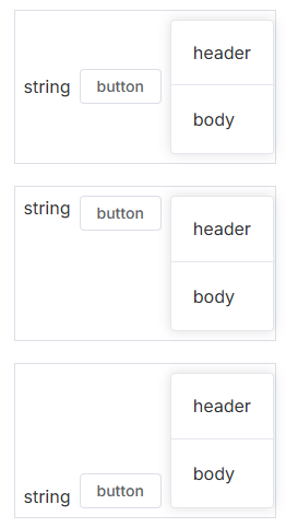
对齐方式 设置该值可以调整所有子节点在容器内的对齐方式,可设置的值与 align-items 一致。
使用 alignment 属性来对齐
⭐控制的是String和button这两个子节点
1 2 3 4 5 6 7 8 9 10 11 12 13 14 15 16 17 18 19 20 21 22 23 24 25 26 27 28 29 30 31 32 <template> <div class="alignment-container"> <el-space> string <el-button> button </el-button> <el-card> <template #header> header </template> body </el-card> </el-space> </div> <div class="alignment-container"> <el-space alignment="flex-start"> string <el-button> button </el-button> <el-card> <template #header> header </template> body </el-card> </el-space> </div> <div class="alignment-container"> <el-space alignment="flex-end"> string <el-button> button </el-button> <el-card> <template #header> header </template> body </el-card> </el-space> </div> </template>
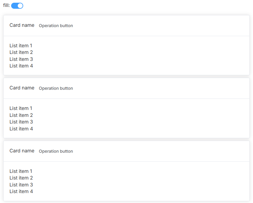
填充容器 通过 fill(布尔类型) 参数,您可以控制子节点是否自动填充容器。
下面的例子中,当设置为 fill 时,子节点的宽度会自动适配容器的宽度。
用 fill 属性让子节点自动填充容器
1 2 3 4 5 6 7 8 9 10 11 12 13 14 15 16 17 18 19 20 21 22 23 24 <template> <div> <div style="margin-bottom: 15px">fill: <el-switch v-model="fill" /></div> <el-space :fill="fill" wrap> <el-card v-for="i in 3" :key="i" class="box-card"> <template #header> <div class="card-header"> <span>Card name</span> <el-button class="button" text>Operation button</el-button> </div> </template> <div v-for="o in 4" :key="o" class="text item"> {{ 'List item ' + o }} </div> </el-card> </el-space> </div> </template> <script lang="ts" setup> import { ref } from 'vue' const fill = ref(true) </script>
也可以使用 fillRatio 参数,自定义填充的比例, 默认值为 100,代表基于父容器宽度的 100% 进行填充
需要注意的是,水平布局和垂直布局的表现形式稍有不同,具体的效果可以查看下面的例子
用 fillRatio 自定义填充比例
1 2 3 4 5 6 7 8 9 10 11 12 13 14 15 16 17 18 19 20 21 22 23 24 25 26 27 28 29 30 31 32 33 34 35 36 37 38 39 <template> <div> <div style="margin-bottom: 15px"> direction: <el-radio v-model="direction" value="horizontal">horizontal</el-radio> <el-radio v-model="direction" value="vertical">vertical</el-radio> </div> <div style="margin-bottom: 15px"> fillRatio:<el-slider v-model="fillRatio" /> </div> <el-space fill wrap :fill-ratio="fillRatio" :direction="direction" style="width: 100%" > <el-card v-for="i in 5" :key="i" class="box-card"> <template #header> <div class="card-header"> <span>Card name</span> <el-button class="button" text>Operation button</el-button> </div> </template> <div v-for="o in 4" :key="o" class="text item"> {{ 'List item ' + o }} </div> </el-card> </el-space> </div> </template> <script lang="ts" setup> import { ref } from 'vue' import type { SpaceInstance } from 'element-plus' const direction = ref<SpaceInstance['direction']>('horizontal') const fillRatio = ref(30) </script>
1.11 Typography 排版 我们对字体进行统一规范,力求在各个操作系统下都有最佳展示效果。
字体 字号 行高 Font-family 1 2 font-family : Inter, 'Helvetica Neue' , Helvetica, 'PingFang SC' , 'Hiragino Sans GB' , 'Microsoft YaHei' , '微软雅黑' , Arial, sans-serif;
2 配置组件 Config Provider 被用来提供全局的配置选项,让你的配置能够在全局都能够被访问到。
i18n 配置 通过 Config Provider 来配置多语言,让你的应用可以随时切换语言。
使用两个属性来提供 i18n 相关配置
1 2 3 4 5 6 7 8 9 10 11 12 13 14 15 16 17 18 19 20 21 22 23 24 <template> <div> <el-button mb-2 @click="toggle">Switch Language</el-button> <br /> <el-config-provider :locale="locale"> <el-table mb-1 :data="[]" /> <el-pagination :total="100" /> </el-config-provider> </div> </template> <script lang="ts" setup> import { computed, ref } from 'vue' import zhCn from 'element-plus/dist/locale/zh-cn.mjs' import en from 'element-plus/dist/locale/en.mjs' const language = ref('zh-cn') const locale = computed(() => (language.value === 'zh-cn' ? zhCn : en)) const toggle = () => { language.value = language.value === 'zh-cn' ? 'en' : 'zh-cn' } </script>
对按钮进行配置 是否自动嵌入空格
1 2 3 4 5 6 7 8 9 10 11 12 13 14 15 16 17 18 19 20 21 <template> <div> <div m="b-2"> <el-checkbox v-model="config.autoInsertSpace"> autoInsertSpace </el-checkbox> </div> <el-config-provider :button="config"> <el-button>中文</el-button> </el-config-provider> </div> </template> <script lang="ts" setup> import { reactive } from 'vue' const config = reactive({ autoInsertSpace: true, }) </script>
Autocomplete自动补全输入框 Autocomplete 组件提供输入建议。通过 el-autocomplete 组件实现。
基础用法 el-autocomplete 组件提供了动态建议功能,允许用户输入部分内容时显示对应的建议列表。
1 2 3 4 5 6 7 8 9 10 11 12 13 14 15 16 17 18 19 20 21 22 23 24 25 26 27 28 29 30 <template> <el-autocomplete v-model="input" :fetch-suggestions="querySearch" placeholder="请输入内容" /> </template> <script lang="ts" setup> import { ref } from 'vue' // 输入内容的绑定变量 const input = ref('') // 提供动态建议的函数 const querySearch = (queryString, callback) => { const suggestions = [ { value: 'Apple' }, { value: 'Banana' }, { value: 'Cherry' }, { value: 'Durian' }, ] const results = queryString ? suggestions.filter((item) => item.value.toLowerCase().includes(queryString.toLowerCase()) ) : suggestions callback(results) } </script>
1. 主要属性 fetch-suggestions
debounce
value-keyvalue。
2. 事件 select
input
change
功能增强 自定义模板 通过 scoped slots 自定义建议项的展示样式:
1 2 3 4 5 6 7 8 9 10 11 12 13 14 15 16 17 18 19 20 21 <template> <el-autocomplete v-model="input" :fetch-suggestions="querySearch" placeholder="请输入内容" > <template #default="{ item }"> <div class="custom-item"> <span>{{ item.value }}</span> </div> </template> </el-autocomplete> </template> <style scoped> .custom-item { display: flex; align-items: center; padding: 8px; } </style>
远程搜索 支持从服务器获取数据,通常结合防抖功能优化用户体验:
1 2 3 4 5 6 7 8 9 10 11 12 13 14 15 16 17 18 19 20 21 <template> <el-autocomplete v-model="input" :fetch-suggestions="fetchRemoteData" placeholder="请输入关键字" :debounce="300" /> </template> <script lang="ts" setup> import { ref } from 'vue' const input = ref('') const fetchRemoteData = async (queryString, callback) => { if (!queryString) return callback([]) const response = await fetch(`https://api.example.com/search?q=${queryString}`) const data = await response.json() callback(data.results) } </script>
自定义加载 修改加载区域内容
Cascader 级联选择器 Cascader 是一种多级选择器,用于从多个层级的数据结构中选择一项或多项。它通常用于表示树形数据结构的选择,提供层级之间的动态加载和过滤。
基础用法 1 2 3 4 5 6 7 8 9 10 11 12 13 14 15 16 17 18 19 20 21 22 23 24 25 26 27 28 29 30 31 32 33 34 35 36 37 38 39 40 41 42 43 44 45 46 47 48 49 50 51 52 <template> <el-cascader v-model="selectedValue" :options="options" placeholder="Please select" /> </template> <script lang="ts" setup> import { ref } from 'vue' const selectedValue = ref([]) const options = [ { value: 'zhinan', label: '指南', children: [ { value: 'shejiyuanze', label: '设计原则', children: [ { value: 'yizhi', label: '一致', }, { value: 'fankui', label: '反馈', }, ], }, ], }, { value: 'zujian', label: '组件', children: [ { value: 'basic', label: 'Basic', children: [ { value: 'layout', label: 'Layout', }, ], }, ], }, ] </script>
Cascader 的数据需要采用嵌套的树状结构。
每个选项支持以下属性:
value: 选项的值。label: 选项的显示文本。children: 子选项数组。disabled: 是否禁用该选项。
可清空 通过 clearable 设置输入框可清空
1 2 3 <template> <el-cascader :options="options" clearable /> </template>
仅显示最后一级 可以仅在输入框中显示选中项最后一级的标签,而不是选中项所在的完整路径。
属性show-all-levels定义了是否显示完整的路径, 将其赋值为 false 则仅显示最后一级。
1 2 3 <template> <el-cascader :options="options" :show-all-levels="false" /> </template>
多选 在标签中添加 :props="props" 并设置 props = { multiple: true } 来开启多选模式。
正确用法:
1 2 3 4 5 6 <template> <el-cascader :props="props" /> </template> <script lang="ts" setup> const props = { multiple: true } </script>
错误用法:
1 2 3 4 <template> <!-- Object literal binging here is invalid syntax for cascader --> <el-cascader :props="{ multiple: true }" /> </template>
使用多选时,所有选中的标签将默认显示 。 您可以设置 collapse = true 将选中的标签折叠。 您可以设置 max-collapse-tags 来显示最大tag数量,默认1。 您可以使用 collapse-tags-tooltip 属性来启用鼠标悬停折叠文字以显示具体所选值的行为。
悬停显示:
选择任意一级选项 启用该功能后,可让父子节点取消关联,选择任意一级选项。
可通过 props.checkStrictly = true 来设置父子节点取消选中关联,从而达到选择任意一级选项的目的 。
例如,选择第二级
动态加载 当选中某一级时,动态加载该级下的选项。
通过lazy开启动态加载,并通过lazyload来设置加载数据源的方法。 lazyload方法有两个参数,第一个参数node为当前点击的节点,第二个resolve为数据加载完成的回调(必须调用)。 为了更准确的显示节点的状态,还可以对节点数据添加是否为叶子节点的标志位 (默认字段为leaf,可通过props.leaf修改)。 否则,将以有无子节点来判断其是否为叶子节点。
1 2 3 4 5 6 7 8 9 10 11 12 13 14 15 16 17 18 19 20 21 22 23 24 <template> <el-cascader :props="props" /> </template> <script lang="ts" setup> import type { CascaderProps } from 'element-plus' let id = 0 const props: CascaderProps = { lazy: true, lazyLoad(node, resolve) { const { level } = node setTimeout(() => { const nodes = Array.from({ length: level + 1 }).map((item) => ({ value: ++id, label: `Option - ${id}`, leaf: level >= 2, })) // Invoke `resolve` callback to return the child nodes data and indicate the loading is finished. resolve(nodes) }, 1000) }, } </script>
可搜索 开启搜索功能,用户可以通过输入关键词过滤选项。
通过添加filterable来启用过滤。 Cascader 会匹配所有节点的标签和它们的亲节点的标签,是否包含有输入的关键字。 你也可以用filter-method自定义搜索逻辑,接受一个函数,第一个参数是节点node,第二个参数是搜索关键词keyword,通过返回布尔值表示是否命中。
1 2 3 4 5 6 <el-cascader v-model="selectedValue" :options="options" filterable placeholder="Search here" />
自定义节点内容 可以自定义备选项的节点内容
你可以通过 scoped slot 自定义节点的内容。 您可以访问 scope 中的 node 和 data 属性,分别表示当前节点的 Node 对象和当前节点的数据。
1 2 3 4 5 6 7 8 <template> <el-cascader :options="options"> <template #default="{ node, data }"> <span>{{ data.label }}</span> <span v-if="!node.isLeaf"> ({{ data.children.length }}) </span> </template> </el-cascader> </template>
级联面板 级联面板是级联选择器的核心组件,与级联选择器一样,有单选、多选、动态加载等多种功能。
和级联选择器一样,通过 options 来指定选项,也可通过 props 来设置多选、动态加载等功能,具体详情见下方API表格。
1 2 3 4 5 6 7 8 9 10 11 12 13 14 15 16 17 18 19 20 21 22 23 24 25 26 27 28 29 30 31 32 33 34 35 36 37 38 39 40 41 42 43 44 45 46 47 48 49 50 51 52 53 54 55 56 57 58 59 60 61 62 63 64 65 66 67 68 69 70 71 72 73 74 75 76 77 <template> <el-cascader-panel style="width: fit-content" :options="options" /> </template> <script lang="ts" setup> const options = [ { value: 'guide', label: 'Guide', children: [ { value: 'disciplines', label: 'Disciplines', children: [ { value: 'consistency', label: 'Consistency', }, { value: 'feedback', label: 'Feedback', } ], }, { value: 'navigation', label: 'Navigation', children: [ { value: 'side nav', label: 'Side Navigation', }, { value: 'top nav', label: 'Top Navigation', }, ], }, ], }, { value: 'component', label: 'Component', children: [ { value: 'basic', label: 'Basic', children: [ { value: 'layout', label: 'Layout', }, { value: 'color', label: 'Color', } ], }, { value: 'others', label: 'Others', children: [ { value: 'dialog', label: 'Dialog', }, { value: 'tooltip', label: 'Tooltip', } ], }, ], }, ] </script>
Checkbox 多选框 在一组备选项中进行多选。
基础用法 单独使用可以表示两种状态之间的切换,写在标签中的内容为 checkbox 按钮后的介绍。
checkbox-group元素能把多个 checkbox 管理为一组,只需要在 Group 中使用 v-model 绑定 Array 类型的变量即可。 只有一个选项时的默认值类型为 Boolean,当选中时值为true。 el-checkbox 标签中的内容将成为复选框按钮之后的描述。
多选框不可用状态,设置 disabled 属性即可。
1 2 3 4 5 6 7 8 9 10 11 12 13 14 15 16 17 18 19 20 21 22 23 24 25 <template> <div> <el-checkbox v-model="checked1" label="Option 1" size="large" /> <el-checkbox v-model="checked2" label="Option 2" size="large" /> </div> <div class="my-2"> <el-checkbox v-model="checked3" label="Option 1" /> <el-checkbox v-model="checked4" label="Option 2" /> </div> <div class="mt-2"> <el-checkbox v-model="checked5" label="Option 1" size="small" /> <el-checkbox v-model="checked6" label="Option 2" size="small" /> </div> </template> <script lang="ts" setup> import { ref } from 'vue' const checked1 = ref(true) const checked2 = ref(false) const checked3 = ref(false) const checked4 = ref(false) const checked5 = ref(false) const checked6 = ref(false) </script>
多选框组 适用于多个勾选框绑定到同一个数组的情景,通过是否勾选来表示这一组选项中选中的项。
复选框组 (el-checkbox-group)
复选框组的值由 v-model 双向绑定,绑定的值为一个数组。
选中的选项会自动添加到绑定数组中,取消选中时会从数组中移除。
复选框 (el-checkbox)
每个复选框通过 label 设置选项的显示名称。
每个复选框通过 value 表示选项的实际值,当选中时,其 value 会添加到绑定的数组中。
1 2 3 4 5 6 7 8 9 10 11 12 13 14 15 16 17 18 19 <template> <el-checkbox-group v-model="checkList"> <el-checkbox label="Option A" value="Value A" /> <el-checkbox label="Option B" value="Value B" /> <el-checkbox label="Option C" value="Value C" /> <el-checkbox label="disabled" value="Value disabled" disabled /> <el-checkbox label="selected and disabled" value="Value selected and disabled" disabled /> </el-checkbox-group> </template> <script lang="ts" setup> import { ref } from 'vue' const checkList = ref(['Value selected and disabled', 'Value A']) </script>
checkList 是一个 ref 数组,初始值为 ['Value selected and disabled', 'Value A'],表示复选框组中默认选中的两个选项。在界面上会显示 Option A 和 selected and disabled 复选框被默认选中。
当用户选中或取消选中复选框时,checkList 中的值会自动更新,反映当前选中状态。
中间状态 indeterminate 属性用以表示 checkbox 的不确定状态,一般用于实现全选的效果
1 2 3 4 5 6 7 8 9 10 11 12 13 14 15 16 17 18 19 20 21 22 23 24 25 26 27 28 29 30 31 32 33 34 35 36 <template> <el-checkbox v-model="checkAll" :indeterminate="isIndeterminate" @change="handleCheckAllChange" > Check all </el-checkbox> <el-checkbox-group v-model="checkedCities" @change="handleCheckedCitiesChange" > <el-checkbox v-for="city in cities" :key="city" :label="city" :value="city"> {{ city }} </el-checkbox> </el-checkbox-group> </template> <script lang="ts" setup> import { ref } from 'vue' const checkAll = ref(false) const isIndeterminate = ref(true) const checkedCities = ref(['Shanghai', 'Beijing']) const cities = ['Shanghai', 'Beijing', 'Guangzhou', 'Shenzhen'] const handleCheckAllChange = (val: boolean) => { checkedCities.value = val ? cities : [] isIndeterminate.value = false } const handleCheckedCitiesChange = (value: string[]) => { const checkedCount = value.length checkAll.value = checkedCount === cities.length isIndeterminate.value = checkedCount > 0 && checkedCount < cities.length } </script>
可选项目数量的限制 使用 min 和 max 属性能够限制可以被勾选的项目的数量。
1 2 3 4 5 6 7 8 9 10 11 12 13 14 <template> <el-checkbox-group v-model="checkedCities" :min="1" :max="2"> <el-checkbox v-for="city in cities" :key="city" :label="city" :value="city"> {{ city }} </el-checkbox> </el-checkbox-group> </template> <script lang="ts" setup> import { ref } from 'vue' const checkedCities = ref(['Shanghai', 'Beijing']) const cities = ['Shanghai', 'Beijing', 'Guangzhou', 'Shenzhen'] </script>
按钮样式 只需要把 el-checkbox 元素替换为 el-checkbox-button 元素即可。 此外,Element Plus 还提供了size属性。
带有边框 设置border属性可以渲染为带有边框的多选框。
1 <el-checkbox v-model="checked1" label="Option1" size="large" border />
Color Picker 取色器 1 2 3 4 5 6 7 8 9 10 <template> <div class="demo-color-block"> <span class="demonstration">With default value</span> <el-color-picker v-model="color1" /> </div> <div class="demo-color-block"> <span class="demonstration">With no default value</span> <el-color-picker v-model="color2" /> </div> </template>
选择透明度 ColorPicker 支持普通颜色,也支持带 Alpha 通道的颜色,通过show-alpha属性即可控制是否支持透明度的选择。 要启用 Alpha 选择,只需添加 show-alpha 属性。
1 2 3 <template> <el-color-picker v-model="color" show-alpha /> </template>
DatePicker 日期选择器 和 DateTimePicker 日期时间选择器 详情看DatePicker 日期选择器 | Element Plus
表单包含 输入框, 单选框, 下拉选择, 多选框 等用户输入的组件。 使用表单,您可以收集、验证和提交数据。
典型表单 最基础的表单包括各种输入表单项,比如input、select、radio、checkbox等。
在每一个 form 组件中,你需要一个 form-item 字段作为输入项的容器,用于获取值与验证值。
1 2 3 4 5 6 7 8 9 10 11 12 13 14 15 16 17 18 19 20 21 22 23 24 25 26 27 28 29 30 31 32 33 34 35 36 37 38 39 40 41 42 43 44 45 46 47 48 49 50 51 52 53 54 55 56 57 58 59 60 61 62 63 64 65 66 67 68 69 70 71 72 73 74 75 76 77 78 79 80 81 82 83 84 85 <template> <el-form :model="form" label-width="auto" style="max-width: 600px"> <el-form-item label="Activity name"> <el-input v-model="form.name" /> </el-form-item> <el-form-item label="Activity zone"> <el-select v-model="form.region" placeholder="please select your zone"> <el-option label="Zone one" value="shanghai" /> <el-option label="Zone two" value="beijing" /> </el-select> </el-form-item> <el-form-item label="Activity time"> <el-col :span="11"> <el-date-picker v-model="form.date1" type="date" placeholder="Pick a date" style="width: 100%" /> </el-col> <el-col :span="2" class="text-center"> <span class="text-gray-500">-</span> </el-col> <el-col :span="11"> <el-time-picker v-model="form.date2" placeholder="Pick a time" style="width: 100%" /> </el-col> </el-form-item> <el-form-item label="Instant delivery"> <el-switch v-model="form.delivery" /> </el-form-item> <el-form-item label="Activity type"> <el-checkbox-group v-model="form.type"> <el-checkbox value="Online activities" name="type"> Online activities </el-checkbox> <el-checkbox value="Promotion activities" name="type"> Promotion activities </el-checkbox> <el-checkbox value="Offline activities" name="type"> Offline activities </el-checkbox> <el-checkbox value="Simple brand exposure" name="type"> Simple brand exposure </el-checkbox> </el-checkbox-group> </el-form-item> <el-form-item label="Resources"> <el-radio-group v-model="form.resource"> <el-radio value="Sponsor">Sponsor</el-radio> <el-radio value="Venue">Venue</el-radio> </el-radio-group> </el-form-item> <el-form-item label="Activity form"> <el-input v-model="form.desc" type="textarea" /> </el-form-item> <el-form-item> <el-button type="primary" @click="onSubmit">Create</el-button> <el-button>Cancel</el-button> </el-form-item> </el-form> </template> <script lang="ts" setup> import { reactive } from 'vue' // do not use same name with ref const form = reactive({ name: '', region: '', date1: '', date2: '', delivery: false, type: [], resource: '', desc: '', }) const onSubmit = () => { console.log('submit!') } </script>
行内表单
当垂直方向空间受限且表单较简单时,可以在一行内放置表单。
通过设置 inline 属性为 true 可以让表单域变为行内的表单域。
1 <el-form :inline="true" :model="formInline" class="demo-form-inline"></el-form>
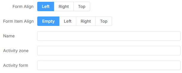
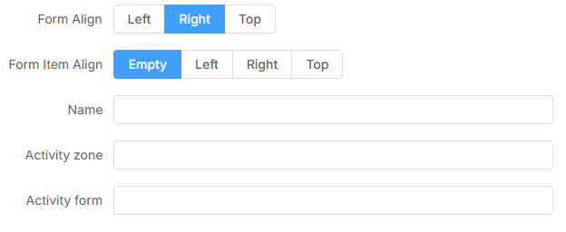
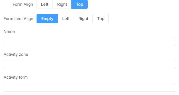
对齐方式 您可以分别设置 el-form-item 的label-position 。 如果值为空, 则会使用 el-form的label-position。
通过设置 label-position 属性可以改变表单域标签的位置,可选值为 top、left, 当设为 top 时标签会置于表单域的顶部
left:
right:
top:
1 2 3 4 5 6 7 8 9 <el-form :label-position="labelPosition" label-width="auto" :model="formLabelAlign" style="max-width: 600px" > <el-form-item label="Form Align" label-position="right"> </el-form-item> </el-form>
⭐表单校验 Form 组件允许你验证用户的输入是否符合规范,来帮助你找到和纠正错误。
Form 组件提供了表单验证的功能,只需为 rules 属性传入约定的验证规则,并将 form-Item 的 prop 属性设置为需要验证的特殊键值即可。 校验规则参见 async-validator
使用步骤:
①定义表单数据
使用响应式对象定义表单的输入数据:
利用 Vue 中的 ref 或 reactive 创建表单数据对象。
确保每个字段有初始值。
1 2 3 4 5 6 7 8 9 <script lang="ts" setup> import { ref } from 'vue'; const formData = ref({ name: '', email: '', age: null, }); </script>
②定义校验规则
常见校验规则包括:
必填项
字符长度限制
数据类型校验(如邮箱、手机号、数字等)
自定义逻辑校验(如密码强度)
1 2 3 4 5 6 7 8 9 10 11 const rules = { name : [{ required : true , message : 'Name is required' , trigger : 'blur' }], email : [ { required : true , message : 'Email is required' , trigger : 'blur' }, { type : 'email' , message : 'Invalid email format' , trigger : 'blur' }, ], age : [ { required : true , message : 'Age is required' , trigger : 'change' }, { type : 'number' , message : 'Age must be a number' , trigger : 'change' }, ], };
③创建表单模板
利用表单组件库(如 Element Plus)渲染表单,绑定数据和校验规则 。
1 2 3 4 5 6 7 8 9 10 11 12 13 14 15 16 17 18 <template> //:rules="rules" ref="formRef"绑定数据和校验规则,prop=""绑定该表单项使用哪个校验方法 <el-form :model="formData" :rules="rules" ref="formRef" label-width="100px"> <el-form-item label="Name" prop="name"> <el-input v-model="formData.name" /> </el-form-item> <el-form-item label="Email" prop="email"> <el-input v-model="formData.email" /> </el-form-item> <el-form-item label="Age" prop="age"> <el-input-number v-model="formData.age" /> </el-form-item> <el-form-item> <el-button type="primary" @click="onSubmit">Submit</el-button> <el-button @click="onReset">Reset</el-button> </el-form-item> </el-form> </template>
⑤校验表单(提交时对表单做校验)
通过表单实例调用校验方法。
调用 validate 方法对整个表单进行校验。
或使用 validateField 对某个字段进行单独校验。
1 2 3 4 5 6 7 8 9 10 11 12 13 14 15 16 17 18 19 20 21 22 23 24 25 26 27 28 29 30 31 32 33 34 35 36 37 38 <script lang="ts" setup> import { ref, reactive } from 'vue' ;import { ElMessage } from 'element-plus' ;const formRef = ref ();const formData = reactive ({ name : '' , email : '' , age : null , }); const rules = { name : [{ required : true , message : 'Name is required' , trigger : 'blur' }], email : [ { required : true , message : 'Email is required' , trigger : 'blur' }, { type : 'email' , message : 'Invalid email format' , trigger : 'blur' }, ], age : [ { required : true , message : 'Age is required' , trigger : 'change' }, { type : 'number' , message : 'Age must be a number' , trigger : 'change' }, ], }; const onSubmit = ( formRef.value .validate ((valid ) => { if (valid) { ElMessage .success ('Form submitted successfully!' ); } else { ElMessage .error ('Please fix validation errors!' ); } }); }; const onReset = ( formRef.value .resetFields (); }; </script>
自定义校验规则 对于复杂的校验逻辑,可以自定义校验函数。
自定义校验函数需要接收 (rule, value, callback) 参数。
没有问题直接callback()
有问题callback(new Error(‘抛出问题’))
1 2 3 4 5 6 7 8 9 10 11 12 13 14 const validateAge = (rule, value, callback ) => { if (value < 18 || value > 60 ) { callback (new Error ('Age must be between 18 and 60' )); } else { callback (); } }; const rules = { age : [ { required : true , message : 'Age is required' , trigger : 'change' }, { validator : validateAge, trigger : 'change' }, ], };
通过 disabled 属性指定是否禁用 input 组件
使用clearable属性即可得到一个可一键清空的输入框
使用 show-password 属性即可得到一个可切换显示隐藏的密码框
要在输入框中添加图标,你可以简单地使用 prefix-icon 和 suffix-icon 属性。 另外, prefix 和 suffix 命名的插槽也能正常工作。
1 2 3 4 5 6 7 8 <template> <el-input v-model="input" style="width: 240px" placeholder="Please input" /> </template> <script lang="ts" setup> import { ref } from 'vue' const input = ref('') </script>
文本域 用于输入多行文本信息可缩放的输入框。 添加 type="textarea" 属性来将 input 元素转换为原生的 textarea 元素。文本域高度可通过 rows 属性控制
自适应文本域 设置文字输入类型的 autosize 属性使得根据内容自动调整的高度。 你可以给 autosize 提供一个包含有最大和最小高度的对象,让输入框自动调整。
复合型输入框 可以在输入框中前置或后置一个元素,通常是标签或按钮。
可通过 slot 来指定在 Input 中分发的前置(prepend)或者后置(append)的内容。
1 2 3 4 5 6 7 8 9 10 11 12 13 14 15 16 17 18 <div> <el-input v-model="input1" style="max-width: 600px" placeholder="Please input" > <template #prepend>Http://</template> </el-input> </div> <div class="mt-4"> <el-input v-model="input2" style="max-width: 600px" placeholder="Please input" > <template #append>.com</template> </el-input> </div>
输入长度限制 使用 maxlength 和 minlength 属性, 来控制输入内容的最大字数和最小字数。 “字符数”使用JavaScript字符串长度来衡量。 为文本或文本输入类型设置 maxlength prop可以限制输入值的长度。 允许你通过设置 show-word-limit 到 true 来显示剩余字数。
仅允许输入标准的数字值,可定义范围
基础用法 要使用它,只需要在 <el-input-number> 元素中使用 v-model 绑定变量即可,变量的初始值即为默认值。
1 2 3 4 5 6 7 8 9 10 11 12 <template> <el-input-number v-model="num" :min="1" :max="10" @change="handleChange" /> </template> <script lang="ts" setup> import { ref } from 'vue' const num = ref(1) const handleChange = (value: number) => { console.log(value) } </script>
⭐当输入无效的字符串到输入框时,由于错误,输入值将把 NaN 导入到上层
Mention 提及 用于在输入中提及某人或某事。
基础用法 最简单的用法。
1 2 3 4 5 6 7 8 9 10 11 12 13 14 15 16 17 18 19 20 21 22 23 24 <template> <el-mention v-model="value" :options="options" style="width: 320px" placeholder="Please input" /> </template> <script setup lang="ts"> import { ref } from 'vue' const value = ref('@') const options = ref([ { label: 'Fuphoenixes', value: 'Fuphoenixes', }, { label: 'kooriookami', value: 'kooriookami', } ]) </script>
Radio 单选框 在一组备选项中进行单选
基础用法 单选框不应该有太多的可选项, 如果你有很多的可选项你应该使用选择框而不是单选框。
要使用 Radio 组件,只需要设置v-model绑定变量, 选中意味着变量的值为相应 Radio value属性的值, value可以是String、Number 或 Boolean。
1 2 3 4 <el-radio-group v-model="radio1"> <el-radio value="1" size="large">Option 1</el-radio> <el-radio value="2" size="large">Option 2</el-radio> </el-radio-group>
Rate 评分 用于评分
基础用法 评分默认被分为三个等级,可以利用颜色数组对分数及情感倾向进行分级(默认情况下不区分颜色)。 三个等级所对应的颜色用 colors 属性设置,而它们对应的两个阈值则通过 low-threshold 和 high-threshold 设定。
1 2 3 4 5 6 7 8 9 10 11 12 13 14 15 16 17 18 19 20 21 22 23 24 25 26 27 28 29 30 31 32 33 34 35 36 37 38 <template> <div class="demo-rate-block"> <span class="demonstration">Default</span> <el-rate v-model="value1" /> </div> <div class="demo-rate-block"> <span class="demonstration">Color for different levels</span> <el-rate v-model="value2" :colors="colors" /> </div> </template> <script lang="ts" setup> import { ref } from 'vue' const value1 = ref(0) const value2 = ref(0) const colors = ref(['#99A9BF', '#F7BA2A', '#FF9900']) // same as { 2: '#99A9BF', 4: { value: '#F7BA2A', excluded: true }, 5: '#FF9900' } </script> <style scoped> .demo-rate-block { padding: 30px 0; text-align: center; border-right: solid 1px var(--el-border-color); display: inline-block; width: 49%; box-sizing: border-box; } .demo-rate-block:last-child { border-right: none; } .demo-rate-block .demonstration { display: block; color: var(--el-text-color-secondary); font-size: 14px; margin-bottom: 20px; } </style>
其他:
属性 allow-half 允许出现半星
为组件设置 show-text 属性会在右侧显示辅助文字。 通过设置 texts 可以为每一个分值指定对应的辅助文字。 texts 为一个数组,长度应等于最大值 max
clearable,当你再次点击相同的值时,可以将值重置为 0。
icons属性可以自定义不同分段的图标,若传入数组,共有 3 个元素,为 3 个分段所对应的类名;若传入对象,可自定义分段,键名为分段的界限值,键值为对应的类名。使用 void-icon 指定未选中时的图标类名
Select 选择器 基础用法 适用广泛的基础单选 v-model 的值为当前被选中的 el-option 的 value 属性值
1 2 3 4 5 6 7 8 9 10 11 12 13 14 15 16 17 18 19 20 21 22 23 24 25 <el-select v-model="value" placeholder="Select" size="large" style="width: 240px" > <el-option v-for="item in options" :key="item.value" :label="item.label" :value="item.value" /> </el-select> <script lang="ts" setup> import { ref } from 'vue' const value = ref('') const options = [ { value: 'Option1', label: 'Option1', } ] </script>
其他:
在 el-option 中,设定 disabled 值为 true,即可禁用该选项
为 el-select 设置 disabled属性,则整个选择器不可用。
为 el-select 设置 clearable 属性,则可将选择器清空。 需要注意的是,clearable 属性仅适用于单选。
Slider 滑块 通过拖动滑块在一个固定区间内进行选择
基础用法 在拖动滑块时,显示当前值。通过设置绑定值自定义滑块的初始值
:show-tooltip:是否显示当前值
:format-tooltip=”formatTooltip”,自定义显示值
1 2 3 4 5 6 7 8 9 10 11 12 13 14 15 16 17 18 19 20 21 22 23 24 25 26 27 28 29 30 31 32 33 34 35 <template> <div class="slider-demo-block"> <span class="demonstration">Default value</span> <el-slider v-model="value1" /> </div> <div class="slider-demo-block"> <span class="demonstration">Customized initial value</span> <el-slider v-model="value2" /> </div> <div class="slider-demo-block"> <span class="demonstration">Hide Tooltip</span> <el-slider v-model="value3" :show-tooltip="false" /> </div> <div class="slider-demo-block"> <span class="demonstration">Format Tooltip</span> <el-slider v-model="value4" :format-tooltip="formatTooltip" /> </div> <div class="slider-demo-block"> <span class="demonstration">Disabled</span> <el-slider v-model="value5" disabled /> </div> </template> <script lang="ts" setup> import { ref } from 'vue' const value1 = ref(0) const value2 = ref(0) const value3 = ref(0) const value4 = ref(0) const value5 = ref(0) const formatTooltip = (val: number) => { return val / 100 } </script>
其他 ①离散值:选项可以是离散的,改变step的值可以改变步长, 通过设置 show-stops 属性可以显示间断点
1 2 3 4 <div class="slider-demo-block"> <span class="demonstration">Breakpoints displayed</span> <el-slider v-model="value2" :step="10" show-stops /> </div>
②带有输入框的滑块:通过输入框输入来改变当前的值。
设置 show-input 属性会在右侧显示一个输入框
1 2 3 <div class="slider-demo-block"> <el-slider v-model="value" show-input /> </div>
③placement自定义 Tooltip 提示的位置。bottom/right/left,默认top
④垂直模式:配置 vertical 属性为 true 启用垂直模式。 在垂直模式下,必须设置 height 属性。
1 2 3 <div class="slider-demo-block"> <el-slider v-model="value" vertical height="200px" /> </div>
⑤范围选择:配置 range 属性以激活范围选择模式,该属性的绑定值是一个数组,由最小边界值和最大边界值组成。
1 2 3 4 5 6 7 8 9 10 11 <template> <div class="slider-demo-block"> <el-slider v-model="value" range show-stops :max="10" /> </div> </template> <script lang="ts" setup> import { ref } from 'vue' const value = ref([4, 8]) </script>
⑥显示图标:设置 marks 属性可以在滑块上显示标记。
1 2 3 4 5 6 7 8 9 10 11 12 13 14 15 16 17 18 19 20 21 22 23 24 25 26 27 28 29 30 31 32 33 34 35 36 37 38 39 40 41 42 <template> <div class="slider-demo-block"> <el-slider v-model="value" range :marks="marks" /> </div> </template> <script lang="ts" setup> import { reactive, ref } from 'vue' import type { CSSProperties } from 'vue' interface Mark { style: CSSProperties label: string } type Marks = Record<number, Mark | string> const value = ref([30, 60]) const marks = reactive<Marks>({ 0: '0°C', 8: '8°C', 37: '37°C', 50: { style: { color: '#1989FA', }, label: '50%', }, }) </script> <style scoped> .slider-demo-block { max-width: 600px; display: flex; align-items: center; } .slider-demo-block .el-slider { margin-top: 0; margin-left: 12px; } </style>
Switch 开关 表示两种相互对立的状态间的切换,多用于触发「开/关」。
基础用法 绑定 v-model 到一个 Boolean 类型的变量。 可以使用 --el-switch-on-color 属性与 --el-switch-off-color 属性来设置开关的背景色。
1 2 3 4 5 6 7 8 9 10 11 12 13 14 15 <template> <el-switch v-model="value1" /> <el-switch v-model="value2" class="ml-2" style="--el-switch-on-color: #13ce66; --el-switch-off-color: #ff4949" /> </template> <script lang="ts" setup> import { ref } from 'vue' const value1 = ref(true) const value2 = ref(true) </script>
Upload 上传 Upload 上传 | Element Plus
Transfer 穿梭框 Transfer 穿梭框是用于在两个面板之间移动列表项的组件,适合用于选择和管理多个选项。
1 2 3 4 5 6 7 8 9 10 11 12 13 14 15 16 17 18 19 20 21 22 <template> <el-transfer v-model="selected" :data="data" filterable filter-placeholder="Search here" /> </template> <script lang="ts" setup> import { ref } from 'vue'; const data = ref([ { key: 1, label: 'Option 1' }, { key: 2, label: 'Option 2' }, { key: 3, label: 'Option 3' }, { key: 4, label: 'Option 4' }, { key: 5, label: 'Option 5' }, ]); const selected = ref([2, 3]); // 默认选中的选项 </script>
左面板 显示可供选择的选项。
右面板 显示已选中的选项。
点击面板中箭头按钮,可以将选项从一侧移动到另一侧。
filterable 属性开启搜索框。
4 Data 数据展示 Card 卡片 将信息聚合在卡片容器中展示。
基础用法 卡片包含标题,内容以及操作区域。
Card 组件由 header body 和 footer组成。 header 和 footer是可选的,其内容取决于一个具名的 slot。
1 2 3 4 5 6 7 8 9 10 11 <template> <el-card style="max-width: 480px"> <template #header> <div class="card-header"> <span>Card name</span> </div> </template> <p v-for="o in 4" :key="o" class="text item">{{ 'List item ' + o }}</p> <template #footer>Footer content</template> </el-card> </template>
简单卡片 卡片可以只有内容区域。
1 2 3 4 5 <template> <el-card style="max-width: 480px"> <p v-for="o in 4" :key="o" class="text item">{{ 'List item ' + o }}</p> </el-card> </template>
有图片内容的卡片 可配置定义更丰富的内容展示。
配置 body-style 属性来自定义 body 部分的样式。 在这个例子中我们还使用了 el-col 组件来布局。
1 2 3 4 5 6 7 8 9 <template> <el-card style="max-width: 480px"> <template #header>Yummy hamburger</template> <img src="https://shadow.elemecdn.com/app/element/hamburger.9cf7b091-55e9-11e9-a976-7f4d0b07eef6.png" style="width: 100%" /> </el-card> </template>
带有阴影效果的卡片 你可以定义什么时候展示卡片的阴影效果。
通过 shadow 属性设置卡片阴影出现的时机。 该属性的值可以是:always、hover 或 never。
1 2 3 4 5 6 7 <template> <div class="flex flex-wrap gap-4"> <el-card style="width: 480px" shadow="always">Always</el-card> <el-card style="width: 480px" shadow="hover">Hover</el-card> <el-card style="width: 480px" shadow="never">Never</el-card> </div> </template>
5 Navigation 导航 Backtop 回到顶部 返回页面顶部的操作按钮。
基础用法 通过滑动来查看容器右下角的按钮。
1 2 3 4 <template> Scroll down to see the bottom-right button. <el-backtop :right="100" :bottom="100" /> </template>
自定义内容 显示区域被固定为 40px * 40px 的区域,其中的内容可支持自定义。
1 2 3 4 5 6 7 8 9 10 11 12 13 14 15 16 17 18 <template> Scroll down to see the bottom-right button. <el-backtop :bottom="100"> <div style=" height: 100%; width: 100%; background-color: var(--el-bg-color-overlay); box-shadow: var(--el-box-shadow-lighter); text-align: center; line-height: 40px; color: #1989fa; " > UP </div> </el-backtop> </template>
Breadcrumb 面包屑 显示当前页面的路径,快速返回之前的任意页面。
基础用法 在 el-breadcrumb 中使用 el-breadcrumb-item 标签表示从首页开始的每一级。 该组件接受一个 String 类型的参数 separator来作为分隔符。 默认值为 ‘/‘。
1 2 3 4 5 6 7 8 9 10 <template> <el-breadcrumb separator="/"> <el-breadcrumb-item :to="{ path: '/' }">homepage</el-breadcrumb-item> <el-breadcrumb-item> <a href="/">promotion management</a> </el-breadcrumb-item> <el-breadcrumb-item>promotion list</el-breadcrumb-item> <el-breadcrumb-item>promotion detail</el-breadcrumb-item> </el-breadcrumb> </template>
图标分隔符 通过设置 separator-class 可使用相应的 iconfont 作为分隔符,注意这将使 separator 失效。
1 2 3 4 5 6 7 8 9 10 11 12 <template> <el-breadcrumb :separator-icon="ArrowRight"> <el-breadcrumb-item :to="{ path: '/' }">homepage</el-breadcrumb-item> <el-breadcrumb-item>promotion management</el-breadcrumb-item> <el-breadcrumb-item>promotion list</el-breadcrumb-item> <el-breadcrumb-item>promotion detail</el-breadcrumb-item> </el-breadcrumb> </template> <script lang="ts" setup> import { ArrowRight } from '@element-plus/icons-vue' </script>
Dropdown 下拉菜单 将动作或菜单折叠到下拉菜单中。
基础用法 悬停在下拉菜单上以展开更多操作。
通过组件 slot 来设置下拉触发的元素以及需要通过具名 slot 为 dropdown 来设置下拉菜单。 默认情况下,只需要悬停在触发菜单的元素上即可,无需点击也会显示下拉菜单。
1 2 3 4 5 6 7 8 9 10 11 12 13 14 15 16 17 18 19 20 21 22 23 24 25 26 27 28 29 30 31 <template> <el-dropdown> <span class="el-dropdown-link"> Dropdown List <el-icon class="el-icon--right"> <arrow-down /> </el-icon> </span> <template #dropdown> <el-dropdown-menu> <el-dropdown-item>Action 1</el-dropdown-item> <el-dropdown-item>Action 2</el-dropdown-item> <el-dropdown-item>Action 3</el-dropdown-item> <el-dropdown-item disabled>Action 4</el-dropdown-item> <el-dropdown-item divided>Action 5</el-dropdown-item> </el-dropdown-menu> </template> </el-dropdown> </template> <script lang="ts" setup> import { ArrowDown } from '@element-plus/icons-vue' </script> <style scoped> .example-showcase .el-dropdown-link { cursor: pointer; color: var(--el-color-primary); display: flex; align-items: center; } </style>
位置 支持 6 个位置。(指的是菜单的小三角的位置)
设置 placement 属性,使下拉菜单出现在不同位置。
1 2 3 4 5 6 7 8 9 10 <el-dropdown placement="top-start"> <el-button> topStart </el-button> <template #dropdown> <el-dropdown-menu> <el-dropdown-item>The Action 1st</el-dropdown-item> <el-dropdown-item>The Action 2st</el-dropdown-item> <el-dropdown-item>The Action 3st</el-dropdown-item> </el-dropdown-menu> </template> </el-dropdown>
触发对象 可使用按钮触发下拉菜单。
设置 split-button 属性来让触发下拉元素呈现为按钮组,左边是功能按钮,右边是触发下拉菜单的按钮 ,设置为 true 即可。 如果你想要在第三和第四个选项之间添加一个分隔符,你只需要为第四个选项添加一个 divider 的 CSS class。
下图左边按钮为普通按钮
1 2 3 4 5 6 7 8 9 10 11 12 13 14 15 16 17 18 19 20 21 22 23 24 25 26 27 28 29 30 <template> <div class="flex flex-wrap items-center"> <el-dropdown> <el-button type="primary"> Dropdown List<el-icon class="el-icon--right"><arrow-down /></el-icon> </el-button> <template #dropdown> <el-dropdown-menu> <el-dropdown-item>Action 1</el-dropdown-item> <el-dropdown-item>Action 2</el-dropdown-item> <el-dropdown-item>Action 3</el-dropdown-item> <el-dropdown-item>Action 4</el-dropdown-item> <el-dropdown-item>Action 5</el-dropdown-item> </el-dropdown-menu> </template> </el-dropdown> <el-dropdown split-button type="primary" @click="handleClick"> Dropdown List <template #dropdown> <el-dropdown-menu> <el-dropdown-item>Action 1</el-dropdown-item> <el-dropdown-item>Action 2</el-dropdown-item> <el-dropdown-item>Action 3</el-dropdown-item> <el-dropdown-item>Action 4</el-dropdown-item> <el-dropdown-item>Action 5</el-dropdown-item> </el-dropdown-menu> </template> </el-dropdown> </div> </template>
触发方式 可以配置点击激活或者悬停激活。
将 trigger 属性设置为 click 即可, 默认为 hover。
1 2 3 4 5 6 7 8 9 10 11 12 <el-dropdown trigger="click"> <span class="el-dropdown-link"> Dropdown List<el-icon class="el-icon--right"><arrow-down /></el-icon> </span> <template #dropdown> <el-dropdown-menu> <el-dropdown-item :icon="Plus">Action 1</el-dropdown-item> <el-dropdown-item :icon="CirclePlusFilled"> Action 2 </el-dropdown-item> </template> </el-dropdown>
菜单隐藏方式 可以通过 hide-on-click 属性来配置。
下拉菜单默认在点击菜单项后会被隐藏,将 hide-on-click 属性设置为 false 可以关闭此功能。
1 2 3 4 5 6 7 8 9 10 11 <el-dropdown :hide-on-click="false"> <span class="el-dropdown-link"> Dropdown List<el-icon class="el-icon--right"><arrow-down /></el-icon> </span> <template #dropdown> <el-dropdown-menu> <el-dropdown-item>Action 1</el-dropdown-item> <el-dropdown-item>Action 2</el-dropdown-item> </el-dropdown-menu> </template> </el-dropdown>
指令事件 点击菜单项后会触发事件,用户可以通过相应的菜单项 key 进行不同的操作。
eg:点击Action1后:
1 2 3 4 5 6 7 8 9 10 11 12 13 14 15 16 17 18 19 20 21 22 23 24 25 <template> <el-dropdown @command="handleCommand"> <span class="el-dropdown-link"> Dropdown List<el-icon class="el-icon--right"><arrow-down /></el-icon> </span> <template #dropdown> <el-dropdown-menu> <el-dropdown-item command="a">Action 1</el-dropdown-item> <el-dropdown-item command="b">Action 2</el-dropdown-item> <el-dropdown-item command="c">Action 3</el-dropdown-item> <el-dropdown-item command="d" disabled>Action 4</el-dropdown-item> <el-dropdown-item command="e" divided>Action 5</el-dropdown-item> </el-dropdown-menu> </template> </el-dropdown> </template> <script lang="ts" setup> import { ElMessage } from 'element-plus' import { ArrowDown } from '@element-plus/icons-vue' const handleCommand = (command: string | number | object) => { ElMessage(`click on item ${command}`) } </script>
为网站提供导航功能的菜单。
⭐如果您想要覆盖el-menu的默认高度, 您可以使用下列CSS:
1 2 3 .el-menu--horizontal { --el-menu-horizontal-height : 100px ; }
顶栏 顶部栏菜单可以在各种场景中使用。
导航菜单默认为垂直模式,通过将 mode 属性设置为 horizontal 来使导航菜单变更为水平模式。 另外,在菜单中通过 sub-menu 组件可以 创建具有子项的可展开菜单项 。 Menu 还提供了background-color、text-color和active-text-color,分别用于设置菜单的背景色、菜单的文字颜色和当前激活菜单的文字颜色。
水平:
垂直:
1 2 3 4 5 6 7 8 9 10 11 12 13 14 15 16 17 18 19 20 21 22 23 24 25 26 27 28 29 30 31 32 33 <template> <el-menu :default-active="activeIndex" class="el-menu-demo" mode="horizontal" @select="handleSelect" > <el-menu-item index="1">Processing Center</el-menu-item> <el-sub-menu index="2"> <template #title>Workspace</template> <el-menu-item index="2-1">item one</el-menu-item> <el-menu-item index="2-2">item two</el-menu-item> <el-menu-item index="2-3">item three</el-menu-item> <el-sub-menu index="2-4"> <template #title>item four</template> <el-menu-item index="2-4-1">item one</el-menu-item> <el-menu-item index="2-4-2">item two</el-menu-item> <el-menu-item index="2-4-3">item three</el-menu-item> </el-sub-menu> </el-sub-menu> <el-menu-item index="3" disabled>Info</el-menu-item> <el-menu-item index="4">Orders</el-menu-item> </el-menu> </template> <script lang="ts" setup> import { ref } from 'vue' const activeIndex = ref('1') const handleSelect = (key: string, keyPath: string[]) => { console.log(key, keyPath) } </script>
左右 您可以将菜单项放置在左边或右边。
添加一个index=“0”的el-menu-item,然后添加css设置。
1 2 3 4 5 6 7 8 9 10 11 12 13 14 15 16 17 18 19 20 21 22 23 24 25 26 27 28 29 30 31 32 33 34 35 36 <template> <el-menu :default -active="activeIndex" class="el-menu -demo" mode="horizontal" :ellipsis="false" @select="handleSelect" > <el-menu-item index="0" > <img style="width: 100px" src="/images/element-plus-logo.svg" alt="Element logo" /> </el-menu-item> <el-menu-item index="1" >Processing Center</el-menu-item> <el-sub-menu index="2" > ... </el-sub-menu> </el-menu> </template> <script lang="ts" setup> import { ref } from 'vue' const activeIndex = ref('1 ') const handleSelect = (key: string, keyPath: string[]) => { console.log (key, keyPath) } </script> <style> .el-menu--horizontal > .el-menu-item :nth-child (1 ) { margin-right : auto; } </style>
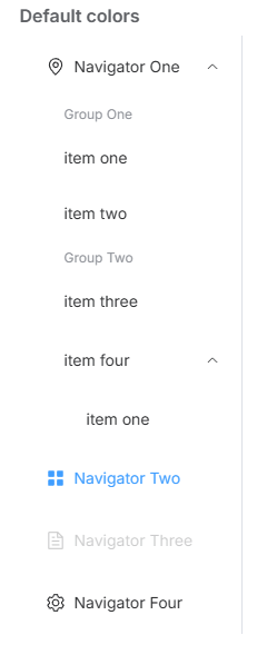
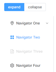
侧栏 垂直菜单,可内嵌子菜单。
通过 el-menu-item-group 组件可以实现菜单进行分组,分组名可以通过 title 属性直接设定,也可以通过具名 slot 来设定。
1 2 3 4 5 6 7 8 9 10 11 12 13 14 15 16 17 18 19 20 21 22 23 24 25 26 27 28 29 30 31 32 33 34 35 36 37 38 39 40 41 42 43 44 45 46 47 48 49 50 51 52 53 54 55 56 57 58 <template> <el-row class="tac"> <el-col :span="12"> <h5 class="mb-2">Default colors</h5> <el-menu default-active="2" class="el-menu-vertical-demo" @open="handleOpen" @close="handleClose" > <el-sub-menu index="1"> <template #title> <el-icon><location /></el-icon> <span>Navigator One</span> </template> <el-menu-item-group title="Group One"> <el-menu-item index="1-1">item one</el-menu-item> <el-menu-item index="1-2">item two</el-menu-item> </el-menu-item-group> <el-menu-item-group title="Group Two"> <el-menu-item index="1-3">item three</el-menu-item> </el-menu-item-group> <el-sub-menu index="1-4"> <template #title>item four</template> <el-menu-item index="1-4-1">item one</el-menu-item> </el-sub-menu> </el-sub-menu> <el-menu-item index="2"> <el-icon><icon-menu /></el-icon> <span>Navigator Two</span> </el-menu-item> <el-menu-item index="3" disabled> <el-icon><document /></el-icon> <span>Navigator Three</span> </el-menu-item> <el-menu-item index="4"> <el-icon><setting /></el-icon> <span>Navigator Four</span> </el-menu-item> </el-menu> </el-col> </el-row> </template> <script lang="ts" setup> import { Document, Menu as IconMenu, Location, Setting, } from '@element-plus/icons-vue' const handleOpen = (key: string, keyPath: string[]) => { console.log(key, keyPath) } const handleClose = (key: string, keyPath: string[]) => { console.log(key, keyPath) } </script>
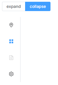
Collapse 折叠面板 垂直导航菜单可以被折叠
1 2 3 4 5 6 7 8 9 10 11 12 13 14 15 16 17 18 19 20 21 22 23 24 25 26 27 28 29 30 31 32 33 34 35 36 37 38 39 40 41 42 43 44 45 46 47 48 49 50 51 52 53 54 55 56 57 58 59 60 61 62 63 64 65 66 67 68 69 <template> <el-radio-group v-model="isCollapse" style="margin-bottom: 20px"> <el-radio-button :value="false">expand</el-radio-button> <el-radio-button :value="true">collapse</el-radio-button> </el-radio-group> <el-menu default-active="2" class="el-menu-vertical-demo" :collapse="isCollapse" @open="handleOpen" @close="handleClose" > <el-sub-menu index="1"> <template #title> <el-icon><location /></el-icon> <span>Navigator One</span> </template> <el-menu-item-group> <template #title><span>Group One</span></template> <el-menu-item index="1-1">item one</el-menu-item> <el-menu-item index="1-2">item two</el-menu-item> </el-menu-item-group> <el-menu-item-group title="Group Two"> <el-menu-item index="1-3">item three</el-menu-item> </el-menu-item-group> <el-sub-menu index="1-4"> <template #title><span>item four</span></template> <el-menu-item index="1-4-1">item one</el-menu-item> </el-sub-menu> </el-sub-menu> <el-menu-item index="2"> <el-icon><icon-menu /></el-icon> <template #title>Navigator Two</template> </el-menu-item> <el-menu-item index="3" disabled> <el-icon><document /></el-icon> <template #title>Navigator Three</template> </el-menu-item> <el-menu-item index="4"> <el-icon><setting /></el-icon> <template #title>Navigator Four</template> </el-menu-item> </el-menu> </template> <script lang="ts" setup> import { ref } from 'vue' import { Document, Menu as IconMenu, Location, Setting, } from '@element-plus/icons-vue' const isCollapse = ref(true) const handleOpen = (key: string, keyPath: string[]) => { console.log(key, keyPath) } const handleClose = (key: string, keyPath: string[]) => { console.log(key, keyPath) } </script> <style> .el-menu-vertical-demo:not(.el-menu--collapse) { width: 200px; min-height: 400px; } </style>
弹出层偏移量 当提供了 popperOffset 配置,会覆盖 Submenu 的 popper-offset.
popper-offset:弹出框离文字的距离
如果页面的路径比较简单,推荐使用页头组件而非面包屑组件。
基础用法 简单场景下的标准页头。
1 2 3 4 5 6 7 8 9 10 11 12 <template> <el-page-header @back="goBack"> <template #content> <span class="text-large font-600 mr-3"> Title </span> </template> </el-page-header> </template> <script lang="ts" setup> const goBack = () => { console.log('go back') } </script>
自定义图标 默认图标可能无法满足您的需求,您可以通过设置icon属性来自定义图标,示例如下。
1 2 3 4 5 6 7 8 9 10 11 <template> <el-page-header :icon="ArrowLeft"> <template #content> <span class="text-large font-600 mr-3"> Title </span> </template> </el-page-header> </template> <script lang="ts" setup> import { ArrowLeft } from '@element-plus/icons-vue' </script>
无图标 有时,页面全是元素,您可能不想展示页面上方的图标,您可以设置icon属性值为""来去除它。
1 2 3 4 5 6 7 <template> <el-page-header icon=""> <template #content> <span class="text-large font-600 mr-3"> Title </span> </template> </el-page-header> </template>
面包屑导航 使用页头组件,您可以通过添加插槽 breadcrumb 来设置面包屑路由导航。
1 2 3 4 5 6 7 8 9 10 11 12 13 14 15 16 17 18 <template> <el-page-header> <template #breadcrumb> <el-breadcrumb separator="/"> <el-breadcrumb-item :to="{ path: './page-header.html' }"> homepage </el-breadcrumb-item> <el-breadcrumb-item ><a href="./page-header.html">route 1</a></el-breadcrumb-item > <el-breadcrumb-item>route 2</el-breadcrumb-item> </el-breadcrumb> </template> <template #content> <span class="text-large font-600 mr-3"> Title </span> </template> </el-page-header> </template>
额外操作部分 头部可能会变得很复杂,您可以在头部添加更多的区块,以允许丰富的交互。
1 2 3 4 5 6 7 8 9 10 11 12 13 14 15 16 17 18 19 20 21 22 23 24 <template> <el-page-header icon=""> <template #content> <div class="flex items-center"> <el-avatar :size="32" class="mr-3" src="https://cube.elemecdn.com/0/88/03b0d39583f48206768a7534e55bcpng.png" /> <span class="text-large font-600 mr-3"> Title </span> <span class="text-sm mr-2" style="color: var(--el-text-color-regular)"> Sub title </span> <el-tag>Default</el-tag> </div> </template> <template #extra> <div class="flex items-center"> <el-button>Print</el-button> <el-button type="primary" class="ml-2">Edit</el-button> </div> </template> </el-page-header> </template>
主要内容 有时我们想让页头显示一些协同响应内容,我们可以使用 default 插槽。
1 2 3 4 5 6 7 8 9 10 11 <template> <el-page-header> <template #content> <span class="text-large font-600 mr-3"> Title </span> </template> <div class="mt-4 text-sm font-bold"> Your additional content can be added with default slot, You may put as many content as you want here. </div> </el-page-header> </template>
组件插槽结构 本组件由这些部件构成:
1 2 3 4 5 6 7 8 9 10 11 12 13 <template> <el-page-header> <!-- Line 1 --> <template #breadcrumb /> <!-- Line 2 --> <template #icon /> <template #title /> <template #content /> <template #extra /> <!-- Lines after 2 --> <template #default /> </el-page-header> </template>
Steps 步骤条 引导用户按照流程完成任务的分步导航条, 可根据实际应用场景设定步骤,步骤不得少于 2 步。
基础用法 简单的步骤条。
设置 active 属性,接受一个 Number,表明步骤的 index,从 0 开始。 需要定宽的步骤条时,设置 space 属性即可,它接受 Number, 单位为 px, 如果不设置,则为自适应。 设置 finish-status 属性可以改变已经完成的步骤的状态。
1 2 3 4 5 6 7 8 9 10 11 12 13 14 15 16 17 18 19 <template> <el-steps style="max-width: 600px" :active="active" finish-status="success"> <el-step title="Step 1" /> <el-step title="Step 2" /> <el-step title="Step 3" /> </el-steps> <el-button style="margin-top: 12px" @click="next">Next step</el-button> </template> <script lang="ts" setup> import { ref } from 'vue' const active = ref(0) const next = () => { if (active.value++ > 2) active.value = 0 } </script>
含状态的步骤条 每一步骤显示出该步骤的状态。
也可以使用 title 具名插槽,可以用 slot 的方式来取代属性的设置, 在本文档最后的列表中有所有的插槽可供参考。
1 2 3 4 5 6 7 8 9 10 11 12 <template> <el-steps style="max-width: 600px" :space="200" :active="1" finish-status="success" > <el-step title="Done" /> <el-step title="Processing" /> <el-step title="Step 3" /> </el-steps> </template>
居中的步骤条 标题和描述可以居中。 ==> 添加align-center
1 2 3 4 5 6 7 <template> <el-steps style="max-width: 600px" :active="2" align-center> <el-step title="Step 1" description="Some description" /> <el-step title="Step 2" description="Some description" /> <el-step title="Step 3" description="Some description" /> </el-steps> </template>
带图标的步骤条 可以在步骤栏中使用各种自定义图标。
通过 icon 属性来设置图标, 图标的类型可以参考 Icon 组件的文档, 除此以外,还能通过具名 slot 来使用自定义的图标。
1 2 3 4 5 6 7 8 9 10 11 <template> <el-steps style="max-width: 600px" :active="1"> <el-step title="Step 1" :icon="Edit" /> <el-step title="Step 2" :icon="Upload" /> <el-step title="Step 3" :icon="Picture" /> </el-steps> </template> <script lang="ts" setup> import { Edit, Picture, Upload } from '@element-plus/icons-vue' </script>
垂直的步骤条 垂直方向的步骤条。
只需要在 el-steps 元素中设置 direction 属性为 vertical 即可。
1 2 3 4 5 6 7 8 9 <template> <div style="height: 300px; max-width: 600px"> <el-steps direction="vertical" :active="1"> <el-step title="Step 1" /> <el-step title="Step 2" /> <el-step title="Step 3" /> </el-steps> </div> </template>
简洁风格的步骤条 设置 simple 可应用简洁风格,该条件下 align-center / description / direction / space 都将失效。
1 2 3 4 5 6 7 8 9 10 11 12 13 14 15 16 17 18 19 20 21 22 23 <template> <el-steps class="mb-4" style="max-width: 600px" :space="200" :active="1" simple > <el-step title="Step 1" :icon="Edit" /> <el-step title="Step 2" :icon="UploadFilled" /> <el-step title="Step 3" :icon="Picture" /> </el-steps> <el-steps style="max-width: 600px" :active="1" finish-status="success" simple> <el-step title="Step 1" /> <el-step title="Step 2" /> <el-step title="Step 3" /> </el-steps> </template> <script lang="ts" setup> import { Edit, Picture, UploadFilled } from '@element-plus/icons-vue' </script>
Tabs 标签页 分隔内容上有关联但属于不同类别的数据集合。
基础用法 基础的、简洁的标签页。
Tabs 组件提供了选项卡功能, 默认选中第一个标签页,你也可以通过 value 属性来指定当前选中的标签页。
1 2 3 4 5 6 7 8 9 10 11 12 13 14 15 16 17 18 19 20 21 22 23 24 25 26 27 <template> <el-tabs v-model="activeName" class="demo-tabs" @tab-click="handleClick"> <el-tab-pane label="User" name="first">User</el-tab-pane> <el-tab-pane label="Config" name="second">Config</el-tab-pane> <el-tab-pane label="Role" name="third">Role</el-tab-pane> <el-tab-pane label="Task" name="fourth">Task</el-tab-pane> </el-tabs> </template> <script lang="ts" setup> import { ref } from 'vue' import type { TabsPaneContext } from 'element-plus' const activeName = ref('first') const handleClick = (tab: TabsPaneContext, event: Event) => { console.log(tab, event) } </script> <style> .demo-tabs > .el-tabs__content { padding: 32px; color: #6b778c; font-size: 32px; font-weight: 600; } </style>
卡片风格的标签 你可以设置具有卡片风格的标签。
只需要设置 type 属性为 card 就可以使选项卡改变为标签风格。
1
2
3
4
5
6
7
8
9
10
11
12
13
<template> <el-tabs v-model="activeName" type="card" class="demo-tabs" @tab-click="handleClick" > <el-tab-pane label="User" name="first">User</el-tab-pane> <el-tab-pane label="Config" name="second">Config</el-tab-pane> <el-tab-pane label="Role" name="third">Role</el-tab-pane> <el-tab-pane label="Task" name="fourth">Task</el-tab-pane> </el-tabs> </template>
添加边框:将 type 设置为 border-card。
1 2 3 4 5 6 7 8 <template> <el-tabs type="border-card"> <el-tab-pane label="User">User</el-tab-pane> <el-tab-pane label="Config">Config</el-tab-pane> <el-tab-pane label="Role">Role</el-tab-pane> <el-tab-pane label="Task">Task</el-tab-pane> </el-tabs> </template>
标签位置的设置 可以通过 tab-position 设置标签的位置
标签一共有四个方向的设置 tabPosition="left|right|top|bottom"
1 2 3 4 5 6 <el-tabs tab-position='top' style="height: px" class="demo-tabs"> <el-tab-pane label="User"></el-tab-pane> <el-tab-pane label="Config">Config</el-tab-pane> <el-tab-pane label="Role">Role</el-tab-pane> <el-tab-pane label="Task">Task</el-tab-pane> </el-tabs>
自定义标签页的内容 可以通过具名插槽来实现自定义标签页的内容
1 2 3 4 5 6 7 8 9 10 11 12 13 14 15 16 17 18 19 20 <template> <el-tabs type="border-card" class="demo-tabs"> <el-tab-pane> <template #label> <span class="custom-tabs-label"> <el-icon><calendar /></el-icon> <span>Route</span> </span> </template> Route </el-tab-pane> <el-tab-pane label="Config">Config</el-tab-pane> <el-tab-pane label="Role">Role</el-tab-pane> <el-tab-pane label="Task">Task</el-tab-pane> </el-tabs> </template> <script lang="ts" setup> import { Calendar } from '@element-plus/icons-vue' </script>
动态增减标签页 增减标签页按钮只能在选项卡样式(card)的标签页下使用
editable:启用标签页的可编辑功能,允许用户添加或删除标签页。
1 2 3 4 5 6 7 8 9 10 11 12 13 14 15 16 17 18 19 20 21 22 23 24 25 26 27 28 29 30 31 32 33 34 35 36 37 38 39 40 41 42 43 44 45 46 47 48 49 50 51 52 53 54 55 56 57 58 59 60 61 62 63 64 65 66 67 68 69 70 71 72 73 74 75 <template> //@edit="handleTabsEdit":当用户对标签页进行编辑(如添加或删除)时触发 handleTabsEdit 方法。 //v-model="editableTabsValue":绑定 editableTabsValue 来控制当前激活的标签页,v-model 是双向绑定,可以让你在数据中获取和设置当前选中的标签页的 name。 <el-tabs v-model="editableTabsValue" type="card" editable class="demo-tabs" @edit="handleTabsEdit" > <el-tab-pane v-for="item in editableTabs" :key="item.name" :label="item.title" :name="item.name" > {{ item.content }} </el-tab-pane> </el-tabs> </template> <script lang="ts" setup> import { ref } from 'vue' import type { TabPaneName } from 'element-plus' let tabIndex = 2 //editableTabsValue: 一个响应式变量,存储当前激活的标签页的 name,用于同步选中状态。 const editableTabsValue = ref('2') //editableTabs: 一个响应式数组,存储所有的标签页数据。每个标签页是一个对象,包含 title(标题)、name(唯一标识)和 content(标签页的内容) const editableTabs = ref([ { title: 'Tab 1', name: '1', content: 'Tab 1 content', }, { title: 'Tab 2', name: '2', content: 'Tab 2 content', }, ]) //handleTabsEdit(targetName, action) 方法用于处理添加或删除标签页的逻辑: const handleTabsEdit = ( targetName: TabPaneName | undefined, action: 'remove' | 'add' ) => { if (action === 'add') { const newTabName = `${++tabIndex}` editableTabs.value.push({ title: 'New Tab', name: newTabName, content: 'New Tab content', }) editableTabsValue.value = newTabName } else if (action === 'remove') { const tabs = editableTabs.value let activeName = editableTabsValue.value if (activeName === targetName) { tabs.forEach((tab, index) => { if (tab.name === targetName) { const nextTab = tabs[index + 1] || tabs[index - 1] if (nextTab) { activeName = nextTab.name } } }) } editableTabsValue.value = activeName editableTabs.value = tabs.filter((tab) => tab.name !== targetName) } } </script>
添加按钮自定义图标 1 2 3 4 5 6 7 8 9 10 11 12 13 14 15 16 17 18 19 <el-tabs v-model="editableTabsValue" type="card" class="demo-tabs" editable @edit="handleTabsEdit" > <template #add-icon> <el-icon><Select /></el-icon> </template> <el-tab-pane v-for="item in editableTabs" :key="item.name" :label="item.title" :name="item.name" > {{ item.content }} </el-tab-pane> </el-tabs>
6 Feedback 反馈组件 Alert 提示 用于页面中展示重要的提示信息。
基础用法 Alert 组件不属于浮层元素,不会自动消失或关闭。
Alert 组件提供四种类型,由 type 属性指定,默认值为 info。
1 2 3 4 5 6 7 8 9 10 11 12 13 14 15 16 17 <template> <div style="max-width: 600px"> <el-alert title="Success alert" type="success" /> <el-alert title="Info alert" type="info" /> <el-alert title="Warning alert" type="warning" /> <el-alert title="Error alert" type="error" /> </div> </template> <style scoped> .el-alert { margin: 20px 0 0; } .el-alert:first-child { margin: 0; } </style>
其他:
通过设置 show-icon 属性来显示 Alert 的 icon,这能更有效地向用户展示你的显示意图。
使用 center 属性来让文字水平居中。
除了必填的 title 属性外,你可以设置 description 属性来帮助你更好地介绍,我们称之为辅助性文字。 辅助性文字只能存放文本内容,当内容超出长度限制时会自动换行显示。
Dialog 对话框 在保留当前页面状态的情况下,告知用户并承载相关操作。
基础用法 Dialog 弹出一个对话框,适合需要定制性更大的场景。
需要设置 model-value / v-model 属性,它接收 Boolean,当为 true 时显示 Dialog。 Dialog 分为两个部分:body 和 footer,footer 需要具名为 footer 的 slot。 title 属性用于定义标题,它是可选的,默认值为空。 最后,本例还展示了 before-close 的用法。
1 2 3 4 5 6 7 8 9 10 11 12 13 14 15 16 17 18 19 20 21 22 23 24 25 26 27 28 29 30 31 32 33 34 35 36 37 38 39 <template> <el-button plain @click="dialogVisible = true"> Click to open the Dialog </el-button> <el-dialog v-model="dialogVisible" title="Tips" width="500" :before-close="handleClose" > <span>This is a message</span> <template #footer> <div class="dialog-footer"> <el-button @click="dialogVisible = false">Cancel</el-button> <el-button type="primary" @click="dialogVisible = false"> Confirm </el-button> </div> </template> </el-dialog> </template> <script lang="ts" setup> import { ref } from 'vue' import { ElMessageBox } from 'element-plus' const dialogVisible = ref(false) const handleClose = (done: () => void) => { ElMessageBox.confirm('Are you sure to close this dialog?') .then(() => { done() }) .catch(() => { // catch error }) } </script>
⭐before-close 只会在用户点击关闭按钮或者对话框的遮罩区域时被调用。 如果你在 footer 具名 slot 里添加了用于关闭 Dialog 的按钮,那么可以在按钮的点击回调函数里加入 before-close 的相关逻辑。
自定义内容 对话框的内容可以是任何东西,甚至是一个表格或表单。
1 2 3 4 5 6 7 <el-dialog v-model="dialogTableVisible" title="Shipping address" width="800"> <el-table :data="gridData"> <el-table-column property="date" label="Date" width="150" /> <el-table-column property="name" label="Name" width="200" /> <el-table-column property="address" label="Address" /> </el-table> </el-dialog>
自定义头部 header 可用于自定义显示标题的区域。 为了保持可用性,除了使用此插槽外,使用 title 属性,或使用 titleId 插槽属性来指定哪些元素应该读取为对话框标题。
1 2 3 4 5 6 7 8 9 10 11 12 <el-dialog v-model="visible" :show-close="false" width="500"> <template #header="{ close, titleId, titleClass }"> <div class="my-header"> <h4 :id="titleId" :class="titleClass">This is a custom header!</h4> <el-button type="danger" @click="close"> <el-icon class="el-icon--left"><CircleCloseFilled /></el-icon> Close </el-button> </div> </template> This is dialog content. </el-dialog>
**{ close, titleId, titleClass }**:这是插槽的作用域插值(scoped slot),它提供了一些自动传递给插槽内容的变量。您可以通过这些变量自定义标题区域的行为和样式
**close**:是一个函数,您可以通过调用它来关闭对话框。在示例中,通过点击自定义的关闭按钮,调用 close() 函数来关闭对话框。
**titleId**:这是 el-dialog 自动生成的标题 ID,用于无障碍访问或与其他元素进行关联。如果需要,您可以将它绑定到标题元素(如 <h4>)的 id 属性。
**titleClass**:这是 el-dialog 自动生成的标题类名,您可以将它应用于标题元素,用于设置默认的样式或进行定制化的样式修改。
嵌套的对话框 如果需要在一个 Dialog 内部嵌套另一个 Dialog,需要使用 append-to-body 属性。
通常我们不建议使用嵌套对话框。 如果你需要在页面上呈现多个对话框,你可以简单地打平它们,以便它们彼此之间是平级关系。 如果必须要在一个对话框内展示另一个对话框,可以将内部嵌套的对话框属性 append-to-body 设置为 true,嵌套的对话框将附加到 body 而不是其父节点,这样两个对话框都可以被正确地渲染。
1 2 3 4 5 6 7 8 9 10 11 12 13 14 15 16 17 18 19 <el-dialog v-model="outerVisible" title="Outer Dialog" width="800"> <span>This is the outer Dialog</span> <el-dialog v-model="innerVisible" width="500" title="Inner Dialog" append-to-body > <span>This is the inner Dialog</span> </el-dialog> <template #footer> <div class="dialog-footer"> <el-button @click="outerVisible = false">Cancel</el-button> <el-button type="primary" @click="innerVisible = true"> Open the inner Dialog </el-button> </div> </template> </el-dialog>
其他:
将center设置为true即可使标题和底部居中。 center仅影响标题和底部区域。 Dialog 的内容是任意的,在一些情况下,内容并不适合居中布局。 如果需要内容也水平居中,请自行为其添加 CSS 样式。
设置 align-center 为 true 使对话框水平垂直居中。 由于对话框垂直居中在弹性盒子中,所以top属性将不起作用。
设置draggable属性为true以做到拖拽 设置 overflow 2.5.4 为 true 可以让拖拽范围超出可视区。
Drawer 抽屉 有些时候, Dialog 组件并不满足我们的需求, 比如你的表单很长, 亦或是你需要临时展示一些文档, Drawer 拥有和 Dialog 几乎相同的 API, 在 UI 上带来不一样的体验.
基础用法 呼出一个临时的侧边栏, 可以从多个方向呼出
你必须像 Dialog一样为 Drawer 设置 model-value 属性来控制 Drawer 的显示与隐藏状态,该属性接受一个 boolean 类型。 Drawer 包含三部分: title & body & footer, 其中 title 是一个具名 slot, 你还可以通过 title 属性来设置标题, 默认情况下它是一个空字符串, 其中 body 部分是 Drawer 组件的主区域, 它包含了用户定义的主要内容. footer和title用法一致, 用来显示页脚信息. 当 Drawer 打开时,默认设置是从右至左 打开 30% 浏览器宽度。 你可以通过传入对应的 direction 和 size 属性来修改这一默认行为。 下面一个示例将展示如何使用 before-close API,更多详细用法请参考页面底部的 API 部分。
1 2 3 4 5 6 7 8 9 10 11 12 13 14 15 16 17 18 19 20 21 22 23 24 25 26 27 28 29 30 31 32 33 34 35 36 37 38 39 40 41 42 43 44 45 46 47 48 49 50 51 52 53 54 55 56 57 58 59 60 61 62 63 64 65 66 67 68 69 70 71 72 73 74 75 76 77 <template> <el-radio-group v-model="direction"> <el-radio value="ltr">left to right</el-radio> <el-radio value="rtl">right to left</el-radio> <el-radio value="ttb">top to bottom</el-radio> <el-radio value="btt">bottom to top</el-radio> </el-radio-group> <el-button type="primary" style="margin-left: 16px" @click="drawer = true"> open </el-button> <el-button type="primary" style="margin-left: 16px" @click="drawer2 = true"> with footer </el-button> <el-drawer v-model="drawer" title="I am the title" :direction="direction" :before-close="handleClose" > <span>Hi, there!</span> </el-drawer> <el-drawer v-model="drawer2" :direction="direction"> <template #header> <h4>set title by slot</h4> </template> <template #default> <div> <el-radio v-model="radio1" value="Option 1" size="large"> Option 1 </el-radio> <el-radio v-model="radio1" value="Option 2" size="large"> Option 2 </el-radio> </div> </template> <template #footer> <div style="flex: auto"> <el-button @click="cancelClick">cancel</el-button> <el-button type="primary" @click="confirmClick">confirm</el-button> </div> </template> </el-drawer> </template> <script lang="ts" setup> import { ref } from 'vue' import { ElMessageBox } from 'element-plus' import type { DrawerProps } from 'element-plus' const drawer = ref(false) const drawer2 = ref(false) const direction = ref<DrawerProps['direction']>('rtl') const radio1 = ref('Option 1') const handleClose = (done: () => void) => { ElMessageBox.confirm('Are you sure you want to close this?') .then(() => { done() }) .catch(() => { // catch error }) } function cancelClick() { drawer2.value = false } function confirmClick() { ElMessageBox.confirm(`Are you confirm to chose ${radio1.value} ?`) .then(() => { drawer2.value = false }) .catch(() => { // catch error }) } </script>
不添加 Title 当你不需要标题的时候,你可以将它移除。
通过设置 with-header 属性为 false 来控制是否显示标题。 如果你的应用需要具备可访问性,请务必设置好 title。
自定义内容 像 Dialog 组件一样,Drawer 也可以用来显示多种不同的交互。
自定义头部 header 可用于自定义显示标题的区域。 为了保持可用性,除了使用此插槽外,使用 title 属性,或使用 titleId 插槽属性来指定哪些元素应该读取为抽屉标题。
嵌套抽屉 你可以像 Dialog 一样拥有多层嵌套的 Drawer
如果你需要在不同图层中多个抽屉,你必须设置 append-to-body 属性到 true
⭐Drawer 的内容是懒渲染的,即在第一次被打开之前,传入的默认 slot 不会被渲染到 DOM 上。 因此,如果需要执行 DOM 操作,或通过 ref 获取相应组件,请在 open 事件回调中进行。
⭐Drawer 还提供一个 destroy-on-close 的 API,用来控制是否在 Drawer 隐藏之后把 Drawer 的默认插槽内的内容销毁。 当你需要每次打开抽屉都要调用 mounted 生命周期时,可以使用此 API。
Loading 加载 加载数据时显示动效。
区域加载 在需要的时候展示加载动画,防止页面失去响应提高用户体验(例如表格)。
Element Plus 提供了两种调用 Loading 的方法:指令和服务。 对于自定义指令 v-loading,只需要绑定 boolean 值即可。 默认状况下,Loading 遮罩会插入到绑定元素的子节点。 通过添加 body 修饰符,可以使遮罩插入至 Dom 中的 body 上。
1 2 3 4 5 6 7 8 9 10 11 12 13 14 15 16 17 18 19 20 21 22 23 24 25 26 27 28 29 30 <template> <el-table v-loading="loading" :data="tableData" style="width: 100%"> <el-table-column prop="date" label="Date" width="180" /> <el-table-column prop="name" label="Name" width="180" /> <el-table-column prop="address" label="Address" /> </el-table> </template> <script lang="ts" setup> import { ref } from 'vue' const loading = ref(true) const tableData = [ { date: '2016-05-02', name: 'John Smith', address: 'No.1518, Jinshajiang Road, Putuo District', } ] </script> <style> body { margin: 0; } .example-showcase .el-loading-mask { z-index: 9; } </style>
自定义加载中组件内容 你可以自定义加载中组件的文字,图标,以及背景颜色。
在绑定了v-loading指令的元素上添加element-loading-text属性,其值会被渲染为加载文案,并显示在加载图标的下方。 类似地,element-loading-spinner、element-loading-background 和 element-loading-svg 属性分别用来设定 svg 图标、背景色值、加载图标。
1 2 3 4 5 6 7 8 9 10 <el-table v-loading="loading" element-loading-text="Loading..." :element-loading-spinner="svg" element-loading-svg-view-box="-10, -10, 50, 50" element-loading-background="rgba(122, 122, 122, 0.8)" :data="tableData" style="width: 100%" > </el-table>
让加载组件铺满整个屏幕 加载数据时显示全屏动画。
当使用指令方式时,全屏遮罩需要添加fullscreen修饰符(遮罩会插入至 body 上) 此时若需要锁定屏幕的滚动,可以使用lock修饰符; 当使用服务方式时,遮罩默认即为全屏,无需额外设置。
1 2 3 4 5 6 7 8 9 10 11 12 13 14 15 16 17 18 19 20 21 22 <template> <el-button v-loading.fullscreen.lock="fullscreenLoading" type="primary" @click="openFullScreen1" > As a directive </el-button> </template> <script lang="ts" setup> import { ref } from 'vue' import { ElLoading } from 'element-plus' const fullscreenLoading = ref(false) const openFullScreen1 = () => { fullscreenLoading.value = true setTimeout(() => { fullscreenLoading.value = false }, 2000) } </script>
Message 消息提示 常用于主动操作后的反馈提示。 与 Notification 的区别是后者更多用于系统级通知的被动提醒。
基础用法 从顶部出现,3 秒后自动消失。
Message 在配置上与 Notification 非常类似,所以部分 options 在此不做详尽解释。 文末有 options 列表,可以结合 Notification 的文档理解它们。 Element Plus 注册了一个全局的 $message方法用于调用。 Message 可以接收一个字符串或一个 VNode 作为参数,它会被显示为正文内容。
不同状态 用来显示「成功、警告、消息、错误」类的操作反馈。
当需要自定义更多属性时,Message 也可以接收一个对象为参数。 比如,设置 type 字段可以定义不同的状态,默认为info。 此时正文内容以 message 的值传入。 同时,我们也为 Message 的各种 type 注册了方法,可以在不传入 type 字段的情况下像 open4 那样直接调用。
1 2 3 4 5 6 7 8 9 10 11 12 13 14 15 16 17 18 19 20 21 22 23 24 25 26 27 28 29 <template> <el-button :plain="true" @click="open2">Success</el-button> <el-button :plain="true" @click="open3">Warning</el-button> <el-button :plain="true" @click="open1">Message</el-button> <el-button :plain="true" @click="open4">Error</el-button> </template> <script lang="ts" setup> import { ElMessage } from 'element-plus' const open1 = () => { ElMessage('This is a message.') } const open2 = () => { ElMessage({ message: 'Congrats, this is a success message.', type: 'success', }) } const open3 = () => { ElMessage({ message: 'Warning, this is a warning message.', type: 'warning', }) } const open4 = () => { ElMessage.error('Oops, this is a error message.') } </script>
其他: 设置背景为plain 1 2 3 4 5 6 7 const open2 = () => { ElMessage({ message: 'Congrats, this is a success message.', type: 'success', plain: true }) }
可关闭的消息提示 可以添加关闭按钮。
默认的 Message 是不可以被人工关闭的。 如果你需要手动关闭功能,你可以把 showClose 设置为 true 此外,和 Notification 一样,Message 拥有可控的 duration, 默认的关闭时间为 3000 毫秒,当把这个属性的值设置为0便表示该消息不会被自动关闭。
文字居中 使用 center 属性让文字水平居中。
1 2 3 4 5 ElMessage({ showClose: true, message: 'Centered text', center: true, })
使用 HTML 片段作为正文内容 message 还支持使用 HTML 字符串作为正文内容。
将dangerouslyUseHTMLString属性设置为 true,message 就会被当作 HTML 片段处理。
1 2 3 4 5 6 7 8 9 10 11 12 13 14 <template> <el-button :plain="true" @click="openHTML">Use HTML string</el-button> </template> <script lang="ts" setup> import { ElMessage } from 'element-plus' const openHTML = () => { ElMessage({ dangerouslyUseHTMLString: true, message: '<strong>This is <i>HTML</i> string</strong>', }) } </script>
MessageBox 消息弹框 模拟系统的消息提示框而实现的一套模态对话框组件,用于消息提示、确认消息和提交内容。
⭐从设计上来说,MessageBox 的作用是美化系统自带的 alert、confirm 和 prompt,因此适合展示较为简单的内容。 如果需要弹出较为复杂的内容,请使用 Dialog。
消息提示 当用户进行操作时会被触发,该对话框中断用户操作,直到用户确认知晓后才可关闭。
调用 ElMessageBox.alert 方法以打开 alert 框。 它模拟了系统的 alert,无法通过按下 ESC 或点击框外关闭。 此例中接收了两个参数,message和title。 值得一提的是,窗口被关闭后,它默认会返回一个Promise对象便于进行后续操作的处理。 若不确定浏览器是否支持Promise,可自行引入第三方 polyfill 或像本例一样使用回调进行后续处理。
确认消息 提示用户确认其已经触发的动作,并询问是否进行此操作时会用到此对话框。
调用 ElMessageBox.confirm 方法以打开 confirm 框。它模拟了系统的 confirm。 Message Box 组件也拥有极高的定制性,我们可以传入 options 作为第三个参数,它是一个字面量对象。 type 字段表明消息类型,可以为success,error,info和 warning,无效的设置将会被忽略。 需要注意的是,第二个参数 title 必须定义为 String 类型,如果是 Object,会被当做为 options使用。 在这里我们返回了一个 Promise 来处理后续响应。
提交内容 当需要用户输入内容时,可以使用 Prompt 类型的消息框。
调用 ElMessageBox.prompt 方法以打开 prompt 框。它模拟了系统的 prompt。 可以用 inputPattern 字段自己规定匹配模式, 使用 inputValidator 来指定验证方法,它应该返回 Boolean 或 String。 返回 false 或 String 表示验证失败, 返回的字符串将用作 inputErrorMessage,用来提示用户错误原因。 此外,可以用 inputPlaceholder 字段来定义输入框的占位符。
个性化 消息弹框可以被定制来展示各种内容。
上面提到的三个方法都是对 ElMessageBox 方法的二次包装。 本例直接调用 ElMessageBox 方法,使用了 showCancelButton 字段,用于显示取消按钮。 另外可使用 cancelButtonClass 为其添加自定义样式,使用 cancelButtonText 来自定义取消按钮文本(Confirm 按钮也具有相同的字段,在文末的 API 说明中有完整的字段列表)。 此例还使用了 beforeClose 属性, 当 beforeClose 被赋值且被赋值为一个回调函数时,在消息弹框被关闭之前将会被调用,并且可以通过该方法来阻止弹框被关闭。 它是一个接收三个参数:action、instance 和done 的方法。 使用它能够在关闭前对实例进行一些操作,比如为确定按钮添加 loading 状态等;此时若需要关闭实例,可以调用 done 方法(若在 beforeClose 中没有调用 done,则弹框便不会关闭)。
Notification 通知 悬浮出现在页面角落,显示全局的通知提醒消息。
基础用法 Element Plus 注册了 $notify 方法并且它接受一个 Object 作为其参数。 在最简单的情况下,你可以通过设置 title 和 message 属性来设置通知的标题和正文内容。 默认情况下,通知在4500毫秒后自动关闭,但你可以通过设置 duration 属性来自定义通知的展示时间。 如果你将它设置为 0,那么通知将不会自动关闭。 需要注意的是 duration 接收一个 Number,单位为毫秒。
1 2 3 4 5 6 7 8 9 10 11 12 13 14 15 16 17 18 19 20 21 22 23 24 <template> <el-button plain @click="open1"> Closes automatically </el-button> <el-button plain @click="open2"> Won't close automatically </el-button> </template> <script lang="ts" setup> import { h } from 'vue' import { ElNotification } from 'element-plus' const open1 = () => { ElNotification({ title: 'Title', message: h('i', { style: 'color: teal' }, 'This is a reminder'), }) } const open2 = () => { ElNotification({ title: 'Prompt', message: 'This is a message that does not automatically close', duration: 0, }) } </script>
不同类型的通知 我们提供了四种不同类型的提醒框:success、warning、info 和error。
Element Plus 为 Notification 组件准备了四种通知类型:success, warning, info, error。 他们可以设置 type 字段来修改,除上述的四个值之外的值会被忽略。 同时,我们也为 Notification 的各种 type 注册了单独的方法,可以在不传入 type 字段的情况下像 open3 和 open4 那样直接调用。
1 2 3 4 5 6 7 8 9 10 11 12 13 14 15 16 17 18 19 20 21 22 23 24 25 26 27 28 29 30 31 32 33 34 35 36 37 38 39 40 41 42 <template> <el-button plain @click="open1"> Success </el-button> <el-button plain @click="open2"> Warning </el-button> <el-button plain @click="open3"> Info </el-button> <el-button plain @click="open4"> Error </el-button> </template> <script lang="ts" setup> import { ElNotification } from 'element-plus' const open1 = () => { ElNotification({ title: 'Success', message: 'This is a success message', type: 'success', }) } const open2 = () => { ElNotification({ title: 'Warning', message: 'This is a warning message', type: 'warning', }) } const open3 = () => { ElNotification({ title: 'Info', message: 'This is an info message', type: 'info', }) } const open4 = () => { ElNotification({ title: 'Error', message: 'This is an error message', type: 'error', }) } </script>
自定义消息弹出的位置 可以让 Notification 从屏幕四角中的任意一角弹出
使用 position 属性设置 Notification 的弹出位置, 支持四个选项:top-right、top-left、bottom-right 和 bottom-left, 默认为 top-right。
1 2 3 4 5 6 7 const open2 = () => { ElNotification({ title: 'Custom Position', message: "I'm at the bottom right corner", position: 'bottom-right', }) }
有位置偏移的通知栏 能够设置偏移量来使 Notification 偏移默认位置。
Notification 提供设置偏移量的功能,通过设置 offset 字段,可以使弹出的消息距屏幕边缘偏移一段距离。 注意在同一时刻,每一个的 Notification 实例应当具有一个相同的偏移量。
1 2 3 4 5 6 7 8 9 10 11 12 13 14 15 <template> <el-button plain @click="open"> Notification with offset </el-button> </template> <script lang="ts" setup> import { ElNotification } from 'element-plus' const open = () => { ElNotification.success({ title: 'Success', message: 'This is a success message', offset: 100, }) } </script>
使用 HTML 片段作为正文内容 message 支持传入 HTML 字符串来作为正文内容。
将 dangerouslyUseHTMLString 属性设置为 true,message 属性就会被当作 HTML 片段处理。
Use HTML String
1 2 3 4 5 6 7 8 9 10 11 12 13 14 15 <template> <el-button plain @click="open"> Use HTML String </el-button> </template> <script lang="ts" setup> import { ElNotification } from 'element-plus' const open = () => { ElNotification({ title: 'HTML String', dangerouslyUseHTMLString: true, message: '<strong>This is <i>HTML</i> string</strong>', }) } </script>
⭐message 属性虽然支持传入 HTML 片段,但是在网站上动态渲染任意 HTML 是非常危险的,因为容易导致 XSS 攻击 。 因此在 dangerouslyUseHTMLString 打开的情况下,请确保 message 的内容是可信的,永远不要 将用户提交的内容赋值给 message 属性。
隐藏关闭按钮 通知的关闭按钮可以被设置为隐藏。
将 showClose 属性设置为 false 即可隐藏关闭按钮。
1 2 3 4 5 6 7 8 9 10 11 12 13 14 15 <template> <el-button plain @click="open"> Hide close button </el-button> </template> <script lang="ts" setup> import { ElNotification } from 'element-plus' const open = () => { ElNotification.success({ title: 'Info', message: 'This is a message without close button', showClose: false, }) } </script>
Popconfirm 气泡确认框 点击某个元素弹出一个简单的气泡确认框
基础用法 Popconfirm 的属性与 Popover 很类似, 因此对于重复属性,请参考 Popover 的文档,在此文档中不做详尽解释。
在 Popconfirm 中,只有 title 属性可用,content 属性会被忽略。
1 2 3 4 5 6 7 <template> <el-popconfirm title="Are you sure to delete this?"> <template #reference> <el-button>Delete</el-button> </template> </el-popconfirm> </template>
自定义弹出框的内容 1 2 3 4 5 6 7 8 9 10 11 12 13 14 15 16 17 18 19 20 21 22 23 24 25 26 27 28 29 30 31 32 33 34 <template> <el-popconfirm width="220" :icon="InfoFilled" icon-color="#626AEF" title="Are you sure to delete this?" @cancel="onCancel" > <template #reference> <el-button>Delete</el-button> </template> <template #actions="{ confirm, cancel }"> <el-button size="small" @click="cancel">No!</el-button> <el-button type="danger" size="small" :disabled="!clicked" @click="confirm" > Yes? </el-button> </template> </el-popconfirm> </template> <script setup lang="ts"> import { ref } from 'vue' import { InfoFilled } from '@element-plus/icons-vue' const clicked = ref(false) function onCancel() { clicked.value = true } </script>
Popover 气泡卡片 基础用法 Popover 是在 ElTooltip 基础上开发出来的。 因此对于重复属性,请参考 Tooltip 的文档,在此文档中不做详尽解释。
trigger 属性被用来决定 popover 的触发方式,支持的触发方式: hover、click、focus 或 contextmenu。 如果你想手动控制它,可以设置 :visible 属性。
1 2 3 4 5 6 7 8 9 10 11 12 13 14 15 16 17 18 19 20 21 22 23 24 25 <template> <el-popover placement="top-start" title="Title" :width="200" trigger="hover" content="this is content, this is content, this is content" > <template #reference> <el-button class="m-2">Hover to activate</el-button> </template> </el-popover> </template> <script lang="ts" setup> import { ref } from 'vue' const visible = ref(false) </script> <style scoped> .el-button + .el-button { margin-left: 8px; } </style>
虚拟触发 在用户界面中不直接依赖于真实的 DOM 元素或硬件事件(如鼠标点击、键盘输入等),而是通过编程逻辑或虚拟元素来实现。
像 Tooltip一样,Popover 可以由虚拟元素触发,这个功能就很适合使用在触发元素和展示内容元素是分开的场景。通常我们使用 #reference 来放置我们的触发元素, 用 triggering-element API,您可以任意设置您的触发元素 但注意到触发元素应该是接受 mouse 和 keyboard 事件的元素。
1 2 3 4 5 6 7 8 9 10 11 12 13 14 15 16 17 18 19 20 21 22 23 24 25 26 <template> <el-button ref="buttonRef" v-click-outside="onClickOutside"> Click me </el-button> <el-popover ref="popoverRef" :virtual-ref="buttonRef" trigger="click" title="With title" virtual-triggering > <span> Some content </span> </el-popover> </template> <script setup lang="ts"> import { ref, unref } from 'vue' import { ClickOutside as vClickOutside } from 'element-plus' const buttonRef = ref() const popoverRef = ref() const onClickOutside = () => { unref(popoverRef).popperRef?.delayHide?.() } </script>
v-click-outside 自定义指令绑定了 onClickOutside 方法。当用户点击组件外部时,会执行 onClickOutside,用于关闭弹出框。
onClickOutside:
内容可扩展 可以在 Popover 中嵌套其它组件, 以下为嵌套表格的例子。
利用插槽取代 content 属性
1 2 3 4 5 6 7 8 9 10 <el-popover placement="right" :width="400" trigger="click"> <template #reference> <el-button style="margin-right: 16px">Click to activate</el-button> </template> <el-table :data="gridData"> <el-table-column width="150" property="date" label="date" /> <el-table-column width="100" property="name" label="name" /> <el-table-column width="300" property="address" label="address" /> </el-table> </el-popover>
嵌套操作 还可以嵌套操作, 它比使用dialog更加轻量。
1 2 3 4 5 6 7 8 9 10 11 12 13 14 15 16 17 18 19 20 <template> <el-popover :visible="visible" placement="top" :width="160"> <p>Are you sure to delete this?</p> <div style="text-align: right; margin: 0"> <el-button size="small" text @click="visible = false">cancel</el-button> <el-button size="small" type="primary" @click="visible = false"> confirm </el-button> </div> <template #reference> <el-button @click="visible = true">Delete</el-button> </template> </el-popover> </template> <script lang="ts" setup> import { ref } from 'vue' const visible = ref(false) </script>
常用于展示鼠标 hover 时的提示信息。
基础用法 在这里我们提供 9 种不同方向的展示方式,可以通过以下完整示例来理解,选择你要的效果。
使用 content 属性来决定 hover 时的提示信息。 由 placement 属性决定展示效果: placement属性值为:[方向]-[对齐位置];四个方向:top、left、right、bottom;三种对齐位置:start, end,默认为空。 如 placement="left-end",则提示信息出现在目标元素的左侧,且提示信息的底部与目标元素的底部对齐。
1 2 3 4 5 6 7 8 9 10 11 12 13 14 15 16 17 18 19 20 21 22 23 24 25 26 27 28 29 30 31 32 <template> <div class="tooltip-base-box"> <div class="row center"> <el-tooltip class="box-item" effect="dark" content="Top Left prompts info" placement="top-start" > <el-button>top-start</el-button> </el-tooltip> </div> </div> </template> <style> .tooltip-base-box { width: 600px; } .tooltip-base-box .row { display: flex; align-items: center; justify-content: space-between; } .tooltip-base-box .center { justify-content: center; } .tooltip-base-box .box-item { width: 110px; margin-top: 10px; } </style>
主题 Tooltip 组件内置了两个主题:dark和light。
通过设置 effect 来修改主题,默认值为 dark.
⭐要使用自定义主题,您必须知道您的工具提示在哪里渲染, 如果您的工具提示被呈现为根元素,您将需要全局设置css规则。
建议您使用自定义主题并同时显示箭头时不使用线性渐变背景颜色。 因为弹出箭头和内容是两个不同的元素, 弹出箭头的样式需要单独设置, 当它到渐变背景颜色时,会看起来很奇怪。
更多内容的文字提示 展示多行文本或者是设置文本内容的格式
用具名 slot content,替代tooltip中的content属性。
1 2 3 4 5 6 <template> <el-tooltip placement="top"> <template #content> multiple lines<br />second line </template> <el-button>Top center</el-button> </el-tooltip> </template>
高级扩展 除了这些基本设置外,还有一些属性可以让使用者更好的定制自己的效果:
transition 属性可以定制显隐的动画效果,默认为fade-in-linear。
如果需要关闭 tooltip 功能,disabled 属性可以满足这个需求, 你只需要将其设置为 true。
事实上,Tooltip 是一个基于 ElPopper 的扩展,您可以使用 ElPopper 中允许的任何属性。
1 2 3 4 5 6 7 8 9 10 11 12 13 14 15 16 17 18 19 20 21 22 23 24 25 26 27 28 29 30 31 32 <template> <el-tooltip :disabled="disabled" content="click to close tooltip function" placement="bottom" effect="light" > <el-button @click="disabled = !disabled"> click to {{ disabled ? 'active' : 'close' }} tooltip function </el-button> </el-tooltip> </template> <script lang="ts" setup> import { ref } from 'vue' const disabled = ref(false) </script> <style> .slide-fade-enter-active { transition: all 0.3s ease; } .slide-fade-leave-active { transition: all 0.3s cubic-bezier(1, 0.5, 0.8, 1); } .slide-fade-enter, .expand-fade-leave-active { margin-left: 20px; opacity: 0; } </style>
⭐Tooltip 内不支持 router-link 组件,请使用 vm.$router.push 代替。
tooltip 内不支持 disabled form 元素,参考 MDN , 请在 disabled form 元素外层添加一层包裹元素。
显示 HTML 内容 内容属性可以设置为 HTML 字符串。
1 2 3 4 5 6 7 8 <template> <el-tooltip content="<span>The content can be <strong>HTML</strong></span>" raw-content > <el-button>hover me</el-button> </el-tooltip> </template>
虚拟触发 有时候我们想把 tooltip 的触发元素放在别的地方,而不需要写在一起,这时候就可以使用虚拟触发。
⭐需要注意的是,虚拟触发的 tooltip 是受控组件,因此你必须自己去控制 tooltip 是否显示,你将无法 通过点击空白处来关闭 tooltip。
单例模式 Tooltip 可以作为单例,也就是是说你可以同时有多个触发同一个 tooltip 的触发元素,这个功能是在 虚拟触发 的基础上开发的。
受控模式 Tooltip 可以通过父组件使用 :visible 来控制它的显示与关闭。
自定义动画 Tooltip 可以自定义动画,你可以根据需要自行设置所需的动画方法。